- Tableau Tutorial
- Tableau - Home
- Tableau - Overview
- Tableau - Environment Setup
- Tableau - Get Started
- Tableau - Navigation
- Tableau - Design Flow
- Tableau - File Types
- Tableau - Data Types
- Tableau - Show Me
- Tableau - Data Terminology
- Tableau Data Sources
- Tableau - Data Sources
- Tableau - Custom Data View
- Tableau - Extracting Data
- Tableau - Fields Operations
- Tableau - Editing Metadata
- Tableau - Data Joining
- Tableau - Data Blending
- Tableau Worksheets
- Tableau - Add Worksheets
- Tableau - Rename Worksheet
- Tableau - Save & Delete Worksheet
- Tableau - Reorder Worksheet
- Tableau - Paged Workbook
- Tableau Calculations
- Tableau - Operators
- Tableau - Functions
- Tableau - Numeric Calculations
- Tableau - String Calculations
- Tableau - Date Calculations
- Tableau - Table Calculations
- Tableau - LOD Expressions
- Tableau Sort & Filters
- Tableau - Basic Sorting
- Tableau - Basic Filters
- Tableau - Quick Filters
- Tableau - Context Filters
- Tableau - Condition Filters
- Tableau - Top Filters
- Tableau - Filter Operations
- Tableau Charts
- Tableau - Bar Chart
- Tableau - Line Chart
- Tableau - Pie Chart
- Tableau - Crosstab
- Tableau - Scatter Plot
- Tableau - Bubble Chart
- Tableau - Bullet Graph
- Tableau - Box Plot
- Tableau - Tree Map
- Tableau - Bump Chart
- Tableau - Gantt Chart
- Tableau - Histogram
- Tableau - Motion Charts
- Tableau - Waterfall Charts
- Tableau Advanced
- Tableau - Dashboard
- Tableau - Formatting
- Tableau - Forecasting
- Tableau - Trend Lines
- Tableau Useful Resources
- Tableau - Question Answers
- Tableau - Quick Guide
- Tableau - Useful Resources
- Tableau - Discussion
- Selected Reading
- UPSC IAS Exams Notes
- Developer's Best Practices
- Questions and Answers
- Effective Resume Writing
- HR Interview Questions
- Computer Glossary
- Who is Who
Tableau - Quick Guide
Tableau - Overview
As a leading data visualization tool, Tableau has many desirable and unique features. Its powerful data discovery and exploration application allows you to answer important questions in seconds. You can use Tableau's drag and drop interface to visualize any data, explore different views, and even combine multiple databases easily. It does not require any complex scripting. Anyone who understands the business problems can address it with a visualization of the relevant data. After analysis, sharing with others is as easy as publishing to Tableau Server.
Tableau Features
Tableau provides solutions for all kinds of industries, departments, and data environments. Following are some unique features which enable Tableau to handle diverse scenarios.
Speed of Analysis − As it does not require high level of programming expertise, any user with access to data can start using it to derive value from the data.
Self-Reliant − Tableau does not need a complex software setup. The desktop version which is used by most users is easily installed and contains all the features needed to start and complete data analysis.
Visual Discovery − The user explores and analyzes the data by using visual tools like colors, trend lines, charts, and graphs. There is very little script to be written as nearly everything is done by drag and drop.
Blend Diverse Data Sets − Tableau allows you to blend different relational, semistructured and raw data sources in real time, without expensive up-front integration costs. The users don’t need to know the details of how data is stored.
Architecture Agnostic − Tableau works in all kinds of devices where data flows. Hence, the user need not worry about specific hardware or software requirements to use Tableau.
Real-Time Collaboration − Tableau can filter, sort, and discuss data on the fly and embed a live dashboard in portals like SharePoint site or Salesforce. You can save your view of data and allow colleagues to subscribe to your interactive dashboards so they see the very latest data just by refreshing their web browser.
Centralized Data − Tableau server provides a centralized location to manage all of the organization’s published data sources. You can delete, change permissions, add tags, and manage schedules in one convenient location. It’s easy to schedule extract refreshes and manage them in the data server. Administrators can centrally define a schedule for extracts on the server for both incremental and full refreshes.
Tableau - Environment Setup
In this chapter, you will learn about the environment setup of Tableau.
Download Tableau Desktop
The Free Personal Edition of Tableau Desktop can be downloaded from Tableau Desktop. You need to register with your details to be able to download.
After downloading, the installation is a very straightforward process in which you need to accept the license agreement and provide the target folder for installation. The following steps and screenshots describe the entire setup process.
Start the Installation Wizard
Double-click the TableauDesktop-64bit-9-2-2.exe. It will present a screen to allow the installation program to run. Click “Run”.

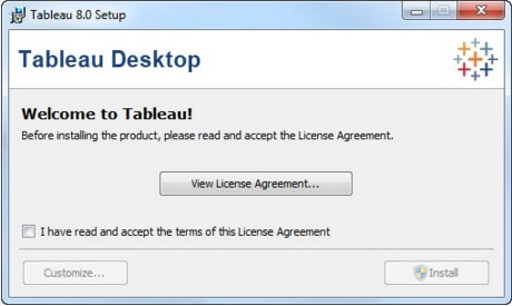
Accept the License Agreement
Read the license agreement and if you agree, choose the "I have read and accept the terms of this license agreement" option. Then, click "Install".
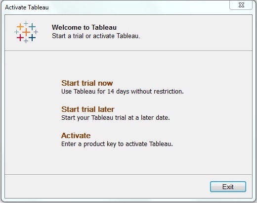
Start Trial
On completion of the installation, the screen prompts you with the option to Start the trial now or later. You may choose to start it now. Also, if you have purchased Tableau then you may enter the License key.
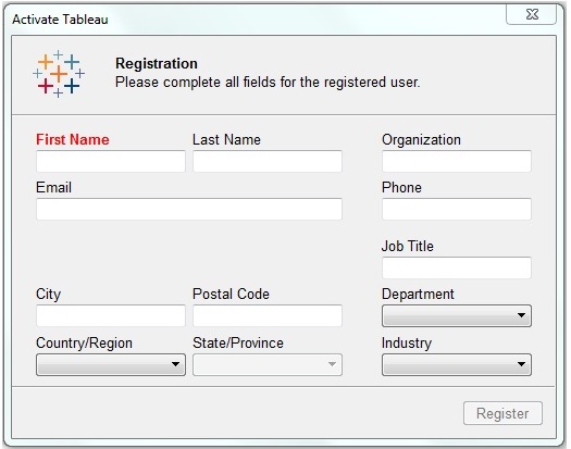
Provide Your Details
Provide your name and organization details. Then, click "Next".
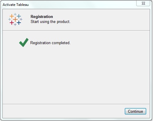
Registration Complete
The registration completion screen appears. Click "Continue".
Verify the Installation
You can verify the installation by going to the Windows start menu. Click the Tableau icon. The following screen appears.
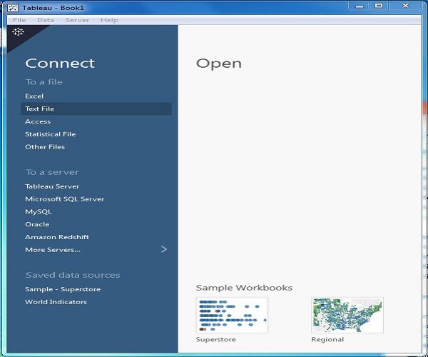
You are now ready to learn Tableau.
Tableau - Get Started
In this chapter, you will learn some basic operations in Tableau to get acquainted with its interface. There are three basic steps involved in creating any Tableau data analysis report.
These three steps are −
Connect to a data source − It involves locating the data and using an appropriate type of connection to read the data.
Choose dimensions and measures − This involves selecting the required columns from the source data for analysis.
Apply visualization technique − This involves applying required visualization methods, such as a specific chart or graph type to the data being analyzed.
For convenience, let’s use the sample data set that comes with Tableau installation named sample – superstore.xls. Locate the installation folder of Tableau and go to My Tableau Repository. Under it, you will find the above file at Datasources\9.2\en_US-US.
Connect to a Data Source
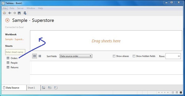
On opening Tableau, you will get the start page showing various data sources. Under the header “Connect”, you have options to choose a file or server or saved data source. Under Files, choose excel. Then navigate to the file “Sample – Superstore.xls” as mentioned above. The excel file has three sheets named Orders, People and Returns. Choose Orders.
Choose the Dimensions and Measures
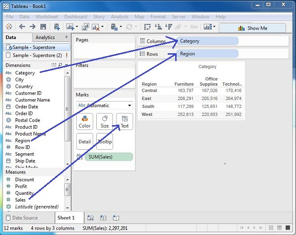
Next, choose the data to be analyzed by deciding on the dimensions and measures. Dimensions are the descriptive data while measures are numeric data. When put together, they help visualize the performance of the dimensional data with respect to the data which are measures. Choose Category and Region as the dimensions and Sales as the measure. Drag and drop them as shown in the following screenshot. The result shows the total sales in each category for each region.
Apply Visualization Technique
In the previous step, you can see that the data is available only as numbers. You have to read and calculate each of the values to judge the performance. However, you can see them as graphs or charts with different colors to make a quicker judgment.
We drag and drop the sum (sales) column from the Marks tab to the Columns shelf. The table showing the numeric values of sales now turns into a bar chart automatically.
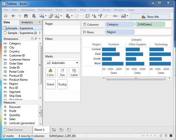
You can apply a technique of adding another dimension to the existing data. This will add more colors to the existing bar chart as shown in the following screenshot.
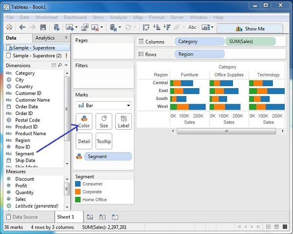
Tableau - Navigation
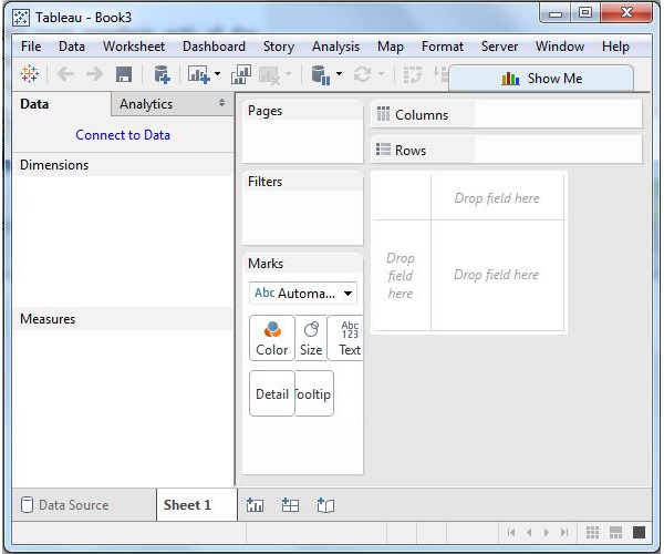
In this chapter, you will get acquainted with various navigational features available in Tableau interface. On running Tableau desktop, you get the menu at the top which shows all the commands we can navigate. Let’s open a blank workbook and go through the various important features under each menu.
Menu Commands
On closing the getting started window, you get the main interface with all the available Menu commands. They represent the entire set of features available in Tableau. Various sections of the menu are shown in the following diagram. Next, you can see some details of each menu.
File Menu
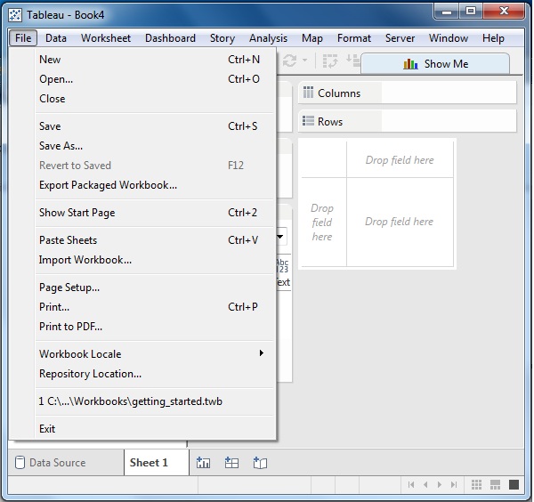
This menu is used to create a new Tableau workbook and open existing workbooks from both the local system and Tableau server. The important features in this menu are −
Workbook Locale sets the language to be used in the report.
Paste Sheets pastes a sheet into the current workbook, which is copied from another workbook.
Export Packaged Workbook option is used to create a packaged workbook, which will be shared with other users.
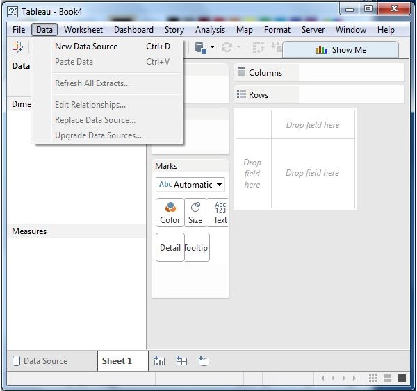
Data Menu
This menu is used to create new data source to fetch the data for analysis and visualization. It also allows you to replace or upgrade the existing data source.
The important features in this menu are as follows −
New Data Source allows to view all the types of connections available and choose from it.
Refresh All Extracts refreshes the data from the source.
Edit Relationships option defines the fields in more than one data source for linking.
Worksheet Menu
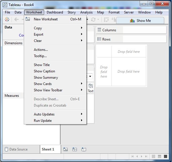
This menu is used to create a new worksheet along with various display features such as showing the title and captions, etc.
The important features in this menu are as follows −
Show Summary allows to view the summary of the data used in the worksheet such as, count, etc.
Tooltip shows the tooltip when hovering above various data fields.
Run Update option updates the worksheet data or filters used.
Dashboard Menu
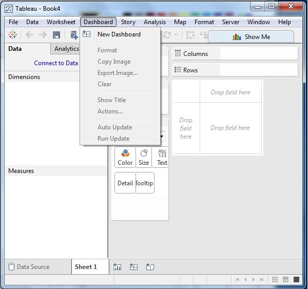
This menu is used to create a new dashboard along with various display features, such as showing the title and exporting the image, etc.
The important features in this menu are as follows −
Format sets the layout in terms of colors and sections of the dashboard.
Actions link the dashboard sheets to external URLs or other sheets.
Export Image option exports an image of the Dashboard.
Story Menu
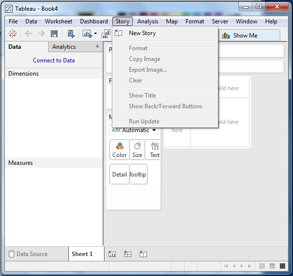
This menu is used to create a new story which has many sheets or dashboards with related data.
The important features in this menu are as follows −
Format sets the layout in terms of colors and sections of the story.
Run Update updates the story with the latest data from the source.
Export Image option exports an image of the story.
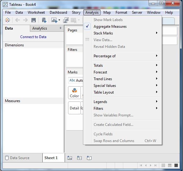
Analysis Menu
This menu is used for analyzing the data present in the sheet. Tableau provides many outof-the-box features, such as calculating the percentage and performing a forecast, etc.
The important features in this menu are as follows −
Forecast shows a forecast based on available data.
Trend Lines shows the trend line for a series of data.
Create Calculated Field option creates additional fields based on certain calculation on the existing fields.
Map Menu
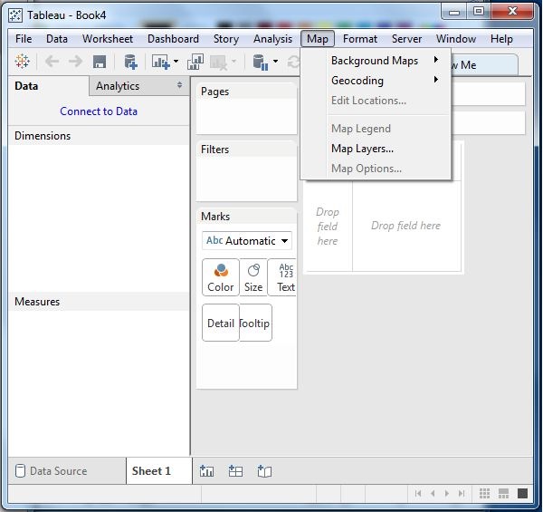
This menu is used for building map views in Tableau. You can assign geographic roles to fields in your data.
The important features in this menu are as follows −
Map Layers hides and shows map layers, such as street names, country borders, and adds data layers.
Geocoding creates new geographic roles and assigns them to the geographic fields in your data.
Format Menu
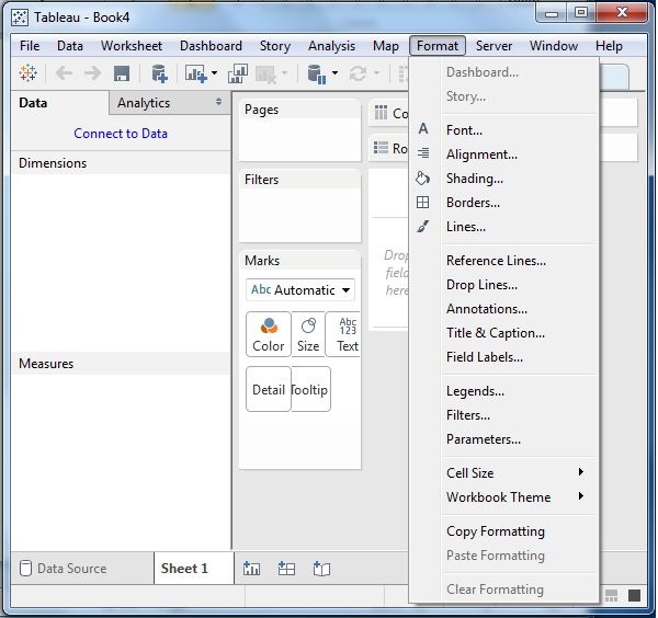
This menu is used for applying the various formatting options to enhance the look and feel of the dashboards created. It provides features such as borders, colors, alignment of text, etc.
The important features in this menu are as follows −
Borders applies borders to the fields displayed in the report.
Title & Caption assigns a title and caption to the reports.
Cell Size customizes the size of the cells displaying the data.
Workbook Theme applies a theme to the entire workbook.
Server Menu
Server Menu is used to login to the Tableau server if you have access, and publish your results to be used by others. It is also used to access the workbooks published by others.
The important features in this menu are as follows −
Publish Workbook publishes the workbook in the server to be used by others.
Publish Data Source publishes the source data used in the workbook.
Create User Filters creates filters on the worksheet to be applied by various users while accessing the report.
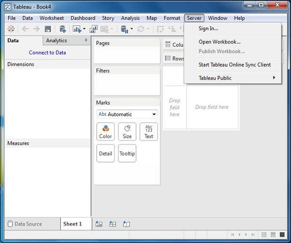
Tableau - Design Flow
As Tableau helps in analyzing lots of data over diverse time periods, dimensions, and measures, it needs a very meticulous planning to create a good dashboard or story. Hence, it is important to know the approach to design a good dashboard. Like any other field of human endeavor, there are many best practices to be followed to create good worksheets and dashboards.
Though the final outcome expected from a Tableau project is ideally a dashboard with story, there are many intermediate steps which needs to be completed to reach this goal. Following is a flow diagram of design steps that should be ideally followed to create effective dashboards.
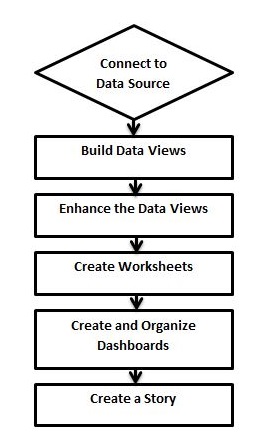
Connect to Data Source
Tableau connects to all popular data sources. It has inbuilt connectors which take care of establishing the connection, once the connection parameters are supplied. Be it simple text files, relational sources, SQL sources or cloud data bases, Tableau connects to nearly every data source.
Build Data Views
After connecting to a data source, you get all the column and data available in the Tableau environment. You classify them as dimensions and measures, and create any hierarchy required. Using these you build views, which are traditionally known as Reports. Tableau provides easy drag and drop feature to build views.
Enhance the Views
The views created above needs to be enhanced further by the use of filters, aggregations, labeling of axes, formatting of colors and borders, etc.
Create Worksheets
Create different worksheets to create different views on the same or different data.
Create and Organize Dashboards
Dashboards contain multiple worksheets which are linked. Hence, the action in any of the worksheet can change the result in the dashboard accordingly.
Create a Story
A story is a sheet that contains a sequence of worksheets or dashboards that work together to convey information. You can create stories to show how facts are connected, provide context, demonstrate how decisions relate to outcomes, or simply make a compelling case.
Tableau - File Types
The result of data analysis in Tableau can be saved in various formats, to be saved and distributed. The various formats are referred as different file types and they are identified by different extensions. Their formats depend on how they are produced and for what purposes they are used. They are all stored as XML files, which can be opened and edited.
Following table lists the description of each file type and their usage.
| File Type | File Extension | Purpose |
|---|---|---|
| Tableau Workbook | .twb | It contains information on each sheet and dashboard that is present in a workbook. It has the details of the fields, which are used in each view and the formula applied to the aggregation of the measures. It also has the formatting and styles applied. It contains the data source connection information and any metadata information created for that connection. |
| Tableau Packaged Workbook | .twbx | This file format contains the details of a workbook as well as the local data that is used in the analysis. Its purpose is to share with other Tableau desktop or Tableau reader users, assuming it does not need data from the server. |
| Tableau Data Source | .tds | The details of the connection used to create the tableau report are stored in this file. In the connection details, it stores the source type (excel/relational/sap, etc.) as well as the data types of the columns. |
| Tableau Packaged Data source | .tdsx | This file is similar to the .tds file with the addition of data along with the connection details. |
| Tableau Data Extract | .tde | This file contains the data used in a .twb file in a highly compressed columnar data format. This helps in storage optimization. It also saves the aggregated calculations that are applied in the analysis. This file should be refreshed to get the updated data from the source. |
| Tableau Bookmark | .tbm | These files contain a single worksheet that is shared easily to be pasted into other workbooks. |
| Tableau Preferences | .tps | This file stores the color preference used across all the workbooks. It is mainly used for consistent look and feel across the users. |
Tableau - Data Types
As a data analysis tool, Tableau classifies every piece of data into one of the four categories namely - String, Number, Boolean and datetime. Once data is loaded from the source, Tableau automatically assigns the data types. Contrarily, you can also change some of the data types if it satisfies the data conversion rule. The user has to specify the data type for calculated fields.
Following table lists the description of data types supported by Tableau.
| Data Type | Description | Example |
|---|---|---|
| STRING | Any sequence of zero or more characters. They are enclosed within single quotes. The quote itself can be included in a string by writing it twice. | 'Hello' 'Quoted' 'quote' |
| NUMBER | These are either integers or floating points. It is advised to round the floating point numbers while using them in calculations. | 3 142.58 |
| BOOLEAN | They are logical values. | TRUE FALSE |
| DATE & DATETIME | Tableau recognizes dates in almost all formats. But in case we need to force Tableau to recognize a string as date, then we put a # sign before the data. | "02/01/2015" "#3 March 1982" |
Tableau - Show Me
As an advanced data visualization tool, Tableau makes the data analysis very easy by providing many analysis techniques without writing any custom code. One such feature is Show Me. It can be used to apply a required view to the existing data in the worksheet. Those views can be a pie chart, scatter plot, or a line chart.
Whenever a worksheet with data is created, it is available in the top right corner as shown in the following figure. Some of the view options will be greyed out depending on the nature of selection in the data pane.
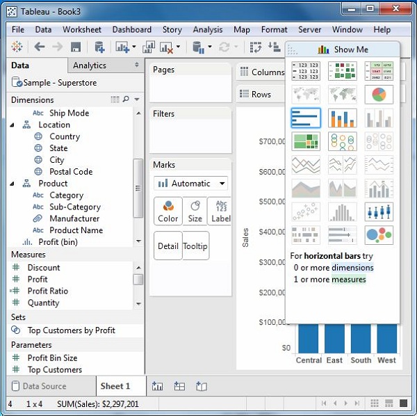
Show Me with Two Fields
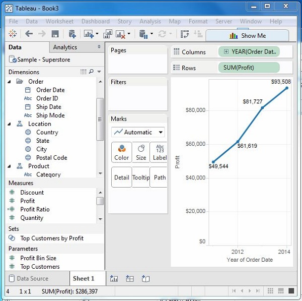
The relation between two fields can be visually analyzed easily by using various graphs and charts available in Show Me. In this case, we choose two fields and apply a line chart. Following are the steps −
Step 1 − Select the two fields (order date and profit) to be analyzed by holding the control key.
Step 2 − Click the Show Me bar and choose line chart.
Step 3 − Click the Mark Label button on the scrollbar.
The following diagram shows the line chart created using the above steps.
Show Me with Multiple Fields
We can apply a similar technique as above to analyze more than 2 fields. The only difference in this case will be the availability of fewer views in active form. Tableau automatically greys out the views that are not appropriate for the analysis of the fields chosen.
In this case, choose the field’s product name, customer name, sales and profit by holding down the control key. As you can observe, most of the views in Show Me are greyed out. From the active views, choose Scatter View.
The following diagram shows the Scatter View chart created.
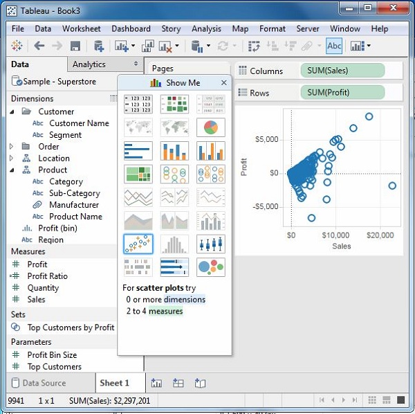
Tableau - Data Terminology
As a powerful data visualization tool, Tableau has many unique terms and definitions. You need to get acquainted with their meaning before you start using the features in Tableau. The following list of terms is comprehensive and explains the terms most frequently used.
| S.No | Terms & Meaning |
|---|---|
| 1 | Alias An alternative name that you can assign to a field or to a dimension member. |
| 2 | Bin A user-defined grouping of measures in the data source. |
| 3 | Bookmark A .tbm file in the Bookmarks folder in the Tableau repository that contains a single worksheet. Much like web browser bookmarks, .tbm files are a convenient way to quickly display different analyses. |
| 4 | Calculated Field A new field that you create by using a formula to modify the existing fields in your data source. |
| 5 | Crosstab A text table view. Use text tables to display the numbers associated with dimension members. |
| 6 | Dashboard A combination of several views arranged on a single page. Use dashboards to compare and monitor a variety of data simultaneously. |
| 7 | Data Pane A pane on the left side of the workbook that displays the fields of the data sources to which Tableau is connected. The fields are divided into dimensions and measures. The data pane also displays custom fields such as calculations, binned fields, and groups. You build views of your data by dragging fields from the data pane onto the various shelves that are a part of every worksheet. |
| 8 | Data Source Page A page where you can set up your data source. The data source page generally consists of four main areas − left pane, join area, preview area, and metadata area. |
| 9 | Dimension A field of categorical data. Dimensions typically hold discrete data such as hierarchies and members that cannot be aggregated. Examples of dimensions include dates, customer names, and customer segments. |
| 10 | Extract A saved subset of a data source that you can use to improve performance and analyze offline. You can create an extract by defining filters and limits that include the data you want in the extract. |
| 11 | Filters Shelf A shelf on the left of the workbook that you can use to exclude data from a view by filtering it using measures and dimensions. |
| 12 | Format Pane A pane that contains formatting settings that control the entire worksheet, as well as individual fields in the view. When open, the Format pane appears on the left side of the workbook. |
| 13 | Level Of Detail (LOD) Expression A syntax that supports aggregation at dimensionalities other than the view level. With the level of detail expressions, you can attach one or more dimensions to any aggregate expression. |
| 14 | Marks A part of the view that visually represents one or more rows in a data source. A mark can be, for example, a bar, line, or square. You can control the type, color, and size of marks. |
| 15 | Marks Card A card to the left of the view, where you can drag fields to control mark properties such as type, color, size, shape, label, tooltip, and detail. |
| 16 | Pages Shelf A shelf to the left of the view that you can use to split a view into a sequence of pages based on the members and values in a discrete or continuous field. Adding a field to the Pages shelf is like adding a field to the Rows shelf, except that a new page is created for each new row. |
| 17 | Rows Shelf A shelf at the top of the workbook that you can use to create the rows of a data table. The shelf accepts any number of dimensions and measures. When you place a dimension on the Rows shelf, Tableau creates headers for the members of that dimension. When you place a measure on the Rows shelf, Tableau creates quantitative axes for that measure. |
| 18 | Shelves Named areas to the left and top of the view. You build views by placing fields onto the shelves. Some shelves are available only when you select certain mark types. For example, the Shape shelf is available only when you select the Shape mark type. |
| 19 | Workbook A file with a .twb extension that contains one or more worksheets (and possibly also dashboards and stories). |
| 20 | Worksheet A sheet where you build views of your data by dragging fields onto shelves. |
Tableau - Data Sources
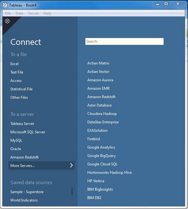
Tableau can connect to all the popular data sources which are widely used. Tableau’s native connectors can connect to the following types of data sources.
File Systems such as CSV, Excel, etc.
Relational Systems such as Oracle, Sql Server, DB2, etc.
Cloud Systems such as Windows Azure, Google BigQuery, etc.
Other Sources using ODBC
The following picture shows most of the data sources available through Tableau’s native data connectors.
Connect Live
The Connect Live feature is used for real-time data analysis. In this case, Tableau connects to real-time data source and keeps reading the data. Thus, the result of the analysis is up to the second, and the latest changes are reflected in the result. However, on the downside, it burdens the source system as it has to keep sending the data to Tableau.
In-Memory
Tableau can also process data in-memory by caching them in memory and not being connected to the source anymore while analyzing the data. Of course, there will be a limit to the amount of data cached depending on the availability of memory.
Combine Data Sources
Tableau can connect to different data sources at the same time. For example, in a single workbook you can connect to a flat file and a relational source by defining multiple connections. This is used in data blending, which is a very unique feature in Tableau.
Tableau - Custom Data View
A custom data view is used to extend the normal data views with some additional features so that the view can give different types of charts for the same underlying data. For example, you can drill down a dimension field which is part of a pre-defined hierarchy so that additional values of the measures are obtained at a different granularity. Following are some of the frequently used and important custom data views Tableau offers.
Drill Down View
For dimension fields which are part of a hierarchy, you usually need to know the result of analysis for the next or previous level of aggregation. For example, when you know the result for a quarter, you get interested to know the results for each month in that quarter, and you may even need the result for each week. This is a case of drilling down the existing dimensions to get a finer level of granularity.
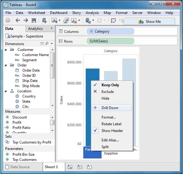
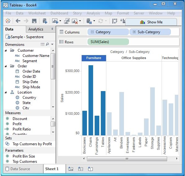
To drill down and drill up for individual dimension members in a hierarchy, right-click a table header and select Drill Down from the context menu. Consider a bar chart created with the dimension category in the columns shelf and the measure Sales in the Rows shelf. Right-click on the bar representing Furniture and select Drill Down.
The result of the drill down action is shown in the following screenshot.
Swapping Dimensions
You can create a new view from an existing view by swapping the position of the dimensions. This does not change the values of the measures, but it does change the position of the measures. Consider a view for analyzing the Profit for each year for each segment and category of products. You can click on the vertical line at the end of category column and drag it to the segment column. This action is shown in the following screenshot.
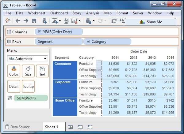
The result of the swapping of the two dimensions is shown in the following screenshot. As you can see, only the position of the values of the measure Profit changes for each category and segment, and not its value.
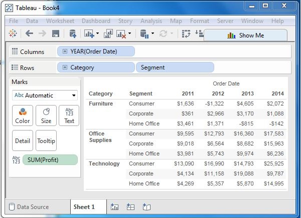
Tableau - Extracting Data
Data extraction in Tableau creates a subset of data from the data source. This is useful in increasing the performance by applying filters. It also helps in applying some features of Tableau to data which may not be available in the data source like finding the distinct values in the data. However, the data extract feature is most frequently used for creating an extract to be stored in the local drive for offline access by Tableau.
Creating an Extract
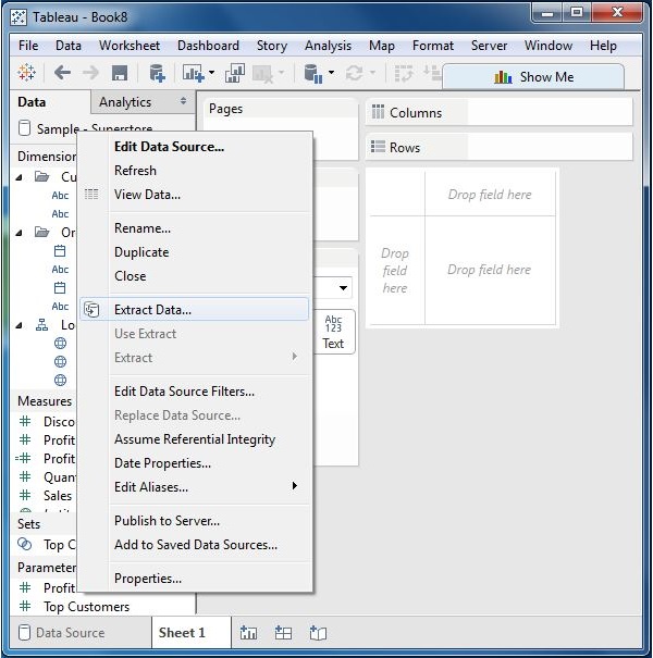
Extraction of data is done by following the menu - Data → Extract Data. It creates many options such as applying limits to how many rows to be extracted and whether to aggregate data for dimensions. The following screen shows the Extract Data option.
Applying Extract Filters
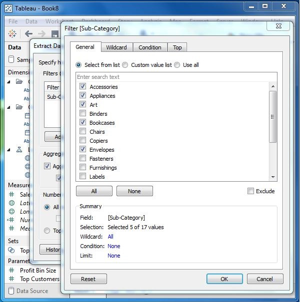
To extract a subset of data from the data source, you can create filters which will return only the relevant rows. Let’s consider the Sample Superstore data set and create an extract. In the filter option, choose Select from list and tick mark the checkbox value for which you need to pull the data from the source.
Adding New Data to Extract
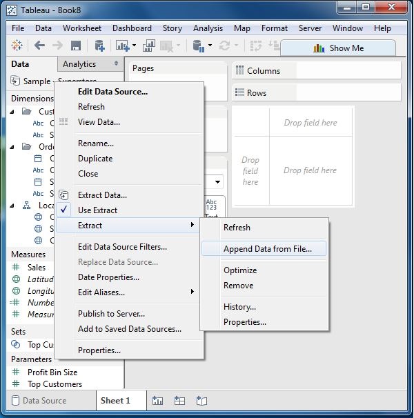
To add more data for an already created extract, you can choose the option Data → Extract → Append Data from File. In this case, browse the file containing the data and click OK to finish. Of course, the number and datatype of columns in the file should be in sync with the existing data.
Extract History
You can verify the history of data extracts to be sure about how many times the extract has happened and at what times.
For this, you can use the menu - Data → Extract History.
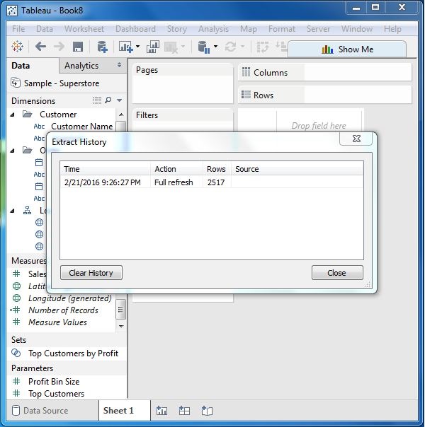
Tableau - Fields Operations
Tableau has many features to manipulate the fields present in Tableau data pane. You can rename the fields or combine two fields to create one field. Such operations help in better organization of the dimensions and measures, as well as accommodate two or more fields with the same name for better data analysis.
Following are the important examples of such Field Operations.
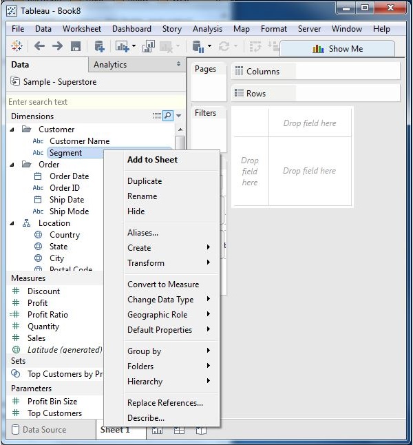
Adding Fields to Worksheet
You can add any field to the worksheet by right-clicking and choosing the option Add to Sheet. You can also drag and drop the fields into different shelves present in the worksheet, like Columns shelf, Rows shelf, Filters shelf, and many other shelves under the Marks card. The following diagram shows the right-click option.
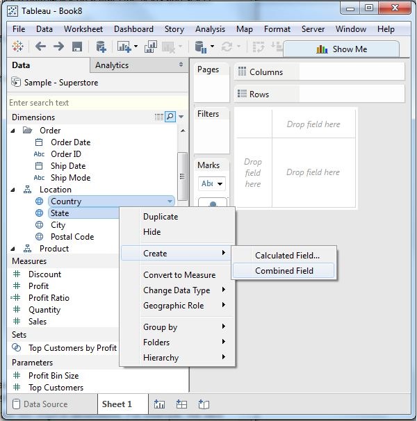
Combining Two Fields
You can combine two dimension fields to create one field. This combined field has a name which is a combination of the individual fields. The values in the dimension get combined to a single value by joining the two strings into one string separated by a comma. However, this default name can be changed by using the rename field operation. The following diagram shows the step to combine two fields.
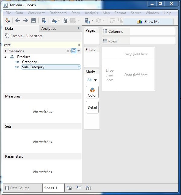
Searching Fields
You can search for names of fields by using the search box option. Writing first three or more letters of the field name brings out the result showing only the fields whose name contains these letters.
Reordering Fields
You can change the position of fields by simply dragging them up and down. In the following example, we drag the field customer name to the place between state and city. This is usually done to bring similar fields together which are frequently used for analysis.
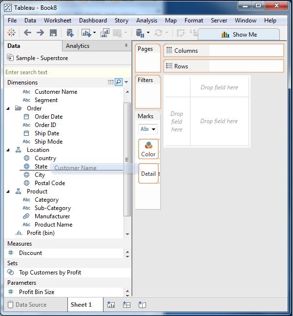
Tableau - Editing Metadata
After connecting to the data source, Tableau captures the metadata details of the source like the columns and their data types. This is used to create the dimensions, measures, and calculated fields used in views. You can browse the metadata and change some of its properties for some specific requirements.
Checking the Metadata
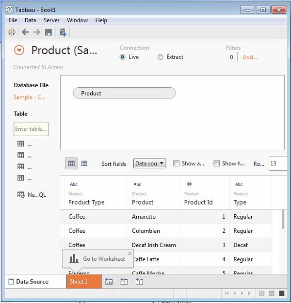
After connecting to a data source, Tableau presents all possible tables and columns present in the source. Consider the source ‘Sample Coffee shop’ for checking the metadata. Click the Data menu and choose to connect to a data source. Browse for the MS access file named ‘Sample - Coffee shop’. Drag the table named Product to the data canvas. On choosing the file, you get the following screen which shows the column names, their data types. The string data types are shown as Abc and Numeric data types are shown as #.
Changing the Data Type
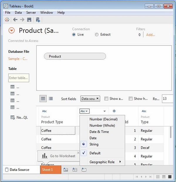
You can change the datatype of some of the fields if required. Depending on the nature of source data, sometimes Tableau may fail to recognize the data type from the source. In such scenarios, we can manually edit the data type. The following screenshot shows the option.
Renaming and Hiding
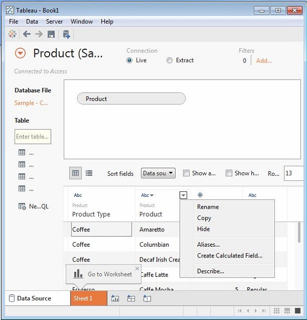
The column names can be changed by using the renaming option. You can also hide a column so that it does not appear in the data view that you create. These options are available by clicking on the data type icon in the metadata grid as shown in the following screenshot.
Column Alias
Each column of the data source can be assigned an alias which helps better understand the nature of the column. You can choose the aliases option from the above step and the following screen comes up which is used to create or edit aliases.
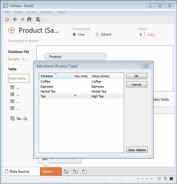
Tableau - Data Joining
Data joining is a very common requirement in any data analysis. You may need to join data from multiple sources or join data from different tables in a single source. Tableau provides the feature to join the table by using the data pane available under Edit Data Source in the Data menu.
Creating a Join
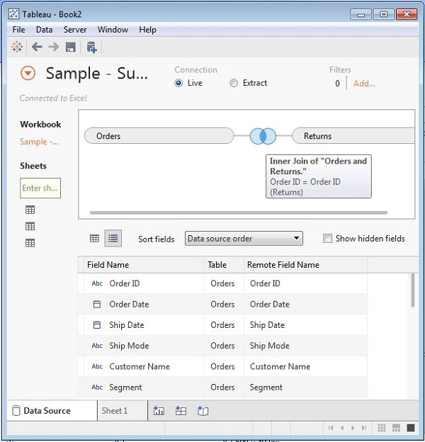
Consider the data source ‘Sample superstore’ to create a join between Orders and Returns table. For this, go to the Data menu and choose the option Edit Data Source. Next, drag the two tables, Orders and Returns to the data pane. Depending on the field name and datatype, Tableau will automatically create a join which can be changed later.
The following screenshot shows the creation of an inner join between Orders and Returns using the Field Order ID.
Editing a Join Type
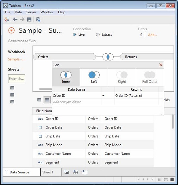
The type of join which the table creates automatically can be changed manually. For this, click the middle of the two circles showing the join. A popup window appears below which shows the four types of joins available. Also Tableau automatically greys out some types of joins, which it finds irrelevant on the basis of data present in the data source.
In the following screenshot, you can see the inner and left outer join as the available joins.
Editing Join Fields
You can also change the fields forming the join condition by clicking the Data Source option available in the join popup window. While selecting the field, you can also search for the field you are looking for using a search text box.
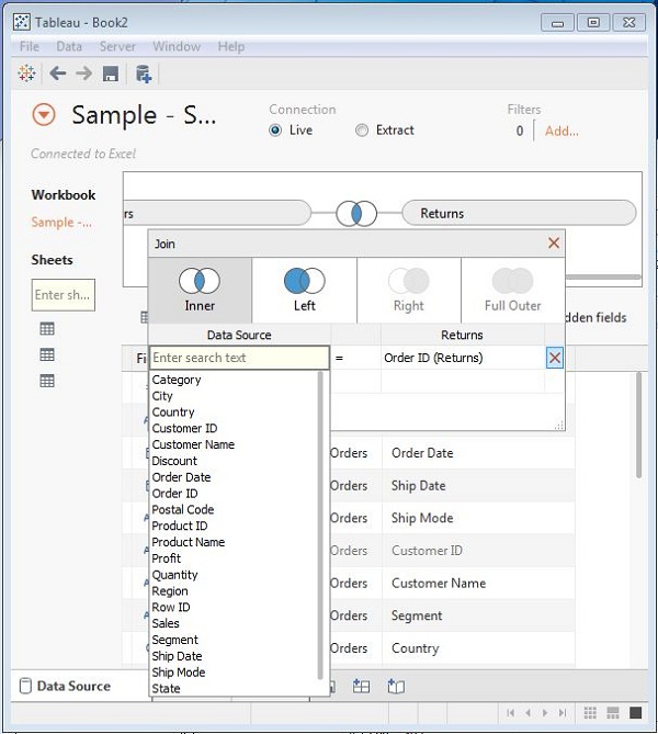
Tableau - Data Blending
Data Blending is a very powerful feature in Tableau. It is used when there is related data in multiple data sources, which you want to analyze together in a single view. As an example, consider the Sales data is present in a relational database and Sales Target data in an Excel spreadsheet. Now, to compare actual sales to target sales, you can blend the data based on common dimensions to get access to the Sales Target measure. The two sources involved in data blending are referred as primary and secondary data sources. A left join is created between the primary data source and the secondary data source with all the data rows from primary and matching data rows from secondary data source.
Preparing Data for Blending
Tableau has two inbuilt data sources named Sample-superstore and Sample coffee chain.mdb which will be used to illustrate data blending.
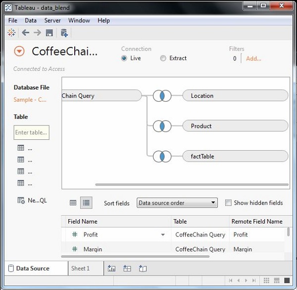
First load the sample coffee chain to Tableau and look at its metadata. Go to the menu - Data → New Data Source and browse for the sample coffee chain file, which is a MS Access database file. The following screenshot shows the different tables and joins available in the file.
Adding Secondary Data Source
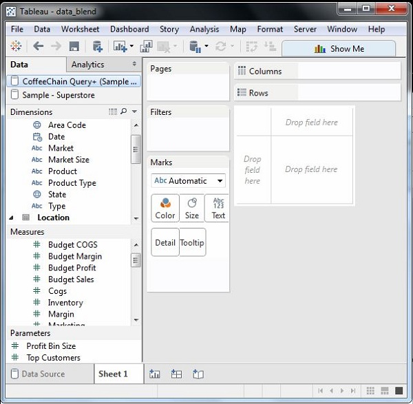
Next, add the secondary data source named Sample-superstore by again following the steps - Data → New Data Source and choosing this data source. Both the data sources now appear on the Data window as shown in the following screenshot.
Blending the Data
Now you can integrate the data from both the above sources based on a common dimension. Note that a small chain image appears next to the dimension named State. This indicates the common dimension between the two data sources. Drag the State field from the primary data source to the rows shelf and the field Profit Ratio from the secondary data source to the Columns shelf. Then, select the bullet chart option from Show Me to get the bullet chart shown in the following screenshot. The chart shows how the profit ratio varies for each state in both the superstore and coffee chain shops.
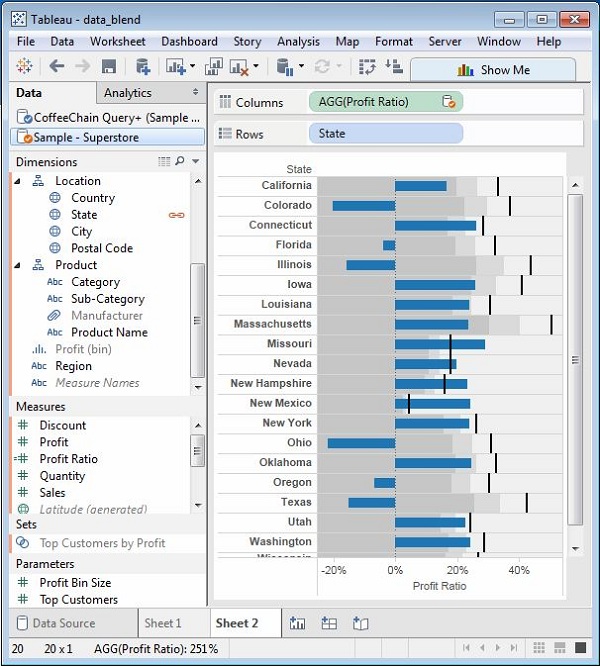
Tableau - Add Worksheets
Worksheet in the Tableau screen is the area where you create the views for data analysis. By default, Tableau provides three blank worksheets when you have established a connection to data source. You can go on adding multiple worksheets to look at different data views in the same screen, one after another.
Adding a Worksheet
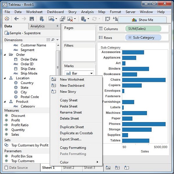
You can add a worksheet in two ways. Right-click on the name of the current worksheet and choose the option New Worksheet from the pop-up menu. You can also click on the small icon to the right of the last sheet name to add a worksheet.
Quick Preview of a Worksheet
Staying in one worksheet, you can have a quick preview of another worksheet by hovering the mouse on the name of the other worksheet.
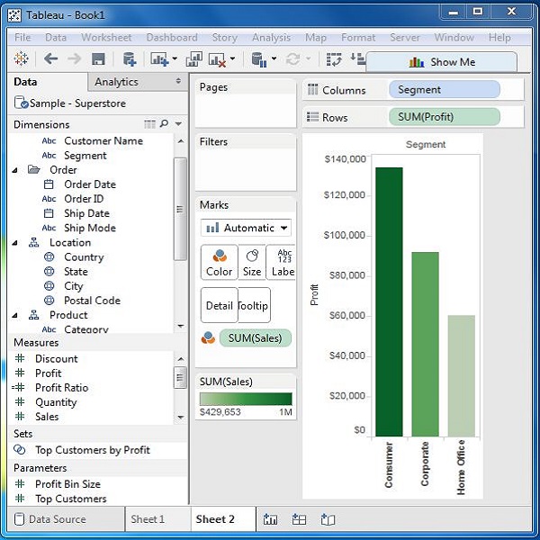
Tableau - Rename Worksheet
You can give appropriate names to the existing worksheets by renaming a worksheet. This helps in relating the content of the worksheet with its name. For example, if we want to know which sheet has the view to know the segment wise profit then with a proper name of the sheet we can identify it.
Renaming the Worksheet
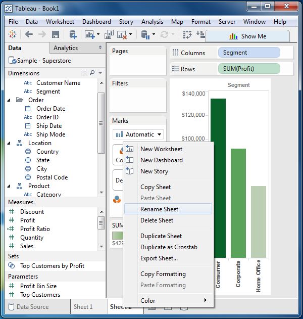
To rename a worksheet, right-click the sheet name and choose the option Rename Sheet.
The following diagram shows the worksheet with the new name.
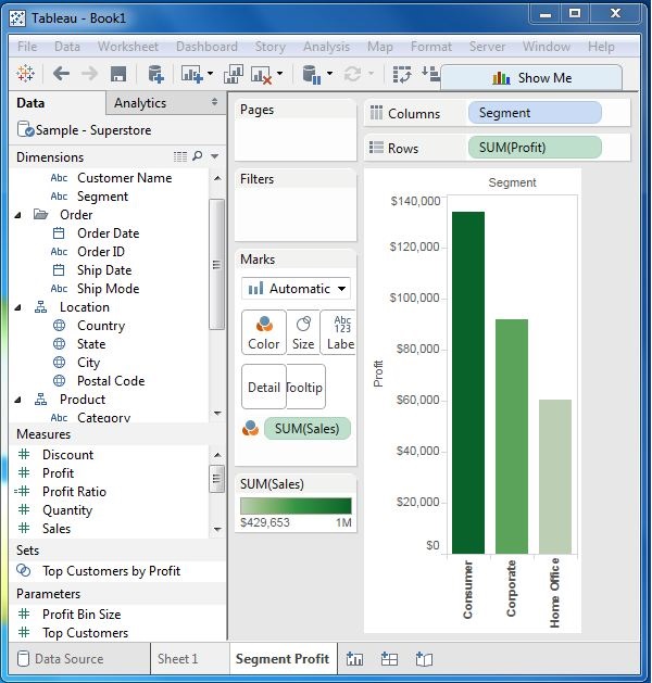
Tableau - Save & Delete Worksheet
An existing worksheet can be both saved and deleted. This helps in organizing the contents in the Tableau desktop environment. While you can save a worksheet by clicking the save button under the main menu, you can delete a worksheet using the following steps.
Deleting the Worksheet
To delete a worksheet, right-click on name of the worksheet and choose the option ‘Delete Sheet’.
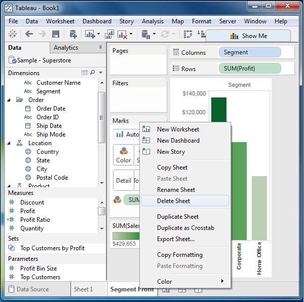
The following screenshot shows the worksheet has been deleted.
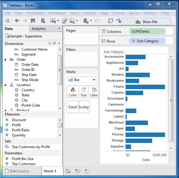
Tableau - Reorder Worksheet
Sometimes you need to change the position of the existing worksheet to study them in a better way. This can be done in a simple way by dragging the sheet name from its existing position to the new position.
Reordering the Worksheet
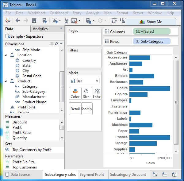
To reorder a worksheet, click and hold the worksheet name and move it to the desired position. Consider the three worksheets as shown in the following screenshot.
The following screenshot shows that a vertical dark line appears in the new position on dragging the third worksheet from left to the new position.
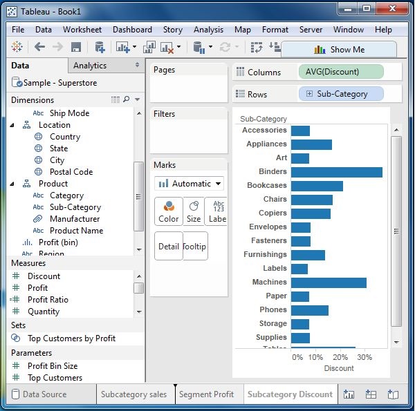
Tableau - Paged Workbook
A paged workbook is used to save the view of the data in different pages for different values of the dimension or measure. A common example is to see how each type of products have performed against each other in a specific sales region. As each of the values of product type is stored as a separate page, we can view them one at a time or see it as a range of values.
Creating Paged Workbook
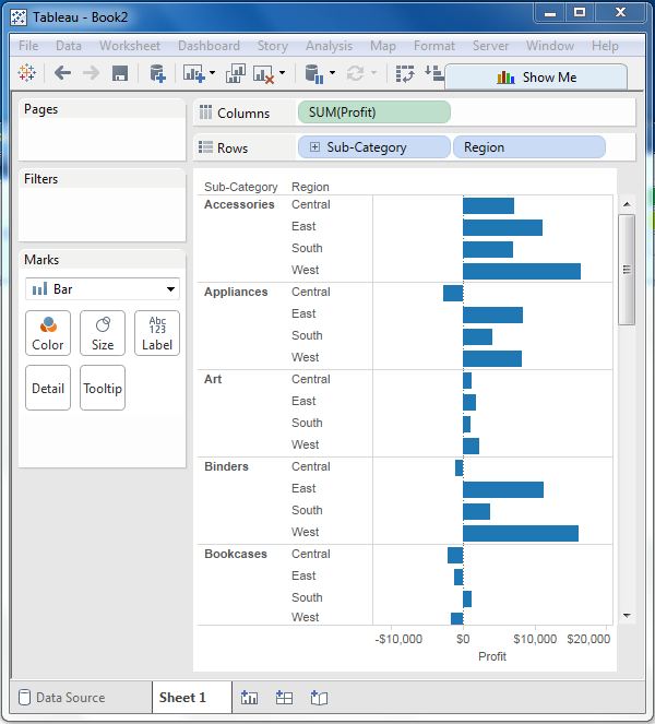
The paged workbook contains worksheets which have fields put in the page shelf. Consider an example of studying the profit of various sub-category of products in different regions. Following are the steps.
Step 1 − Create a bar chart with two dimensions and one measure. In this case, drag the Measure Profit to the columns shelf and the dimensions sub-category, and Region to the rows shelf as shown in the following screenshot.
Step 2 − Drag the Sub-Category field again to the page shelf. You will see that a page control is automatically added, just below the Pages shelf. This page control provides the following features to navigate through the pages in a view −
- Jump to a specific page
- Manually advance through the pages
- Automatically advance through pages
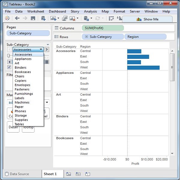
In this case, we will see how to jump to a specific page and how to get the automatic display of pages. To go to a specific page, click on the drop-down on the page control and select Accessories. The chart seen in the following screenshot appears.
Step 3 − For automatic display of pages, keep the show history checkbox ticked and click the play button. You can then see an automatic play of different pages of sub categories. While the current Sub-Category value is shown with a dark color, the previous values are shaded with light color. The following screenshot illustrates this.
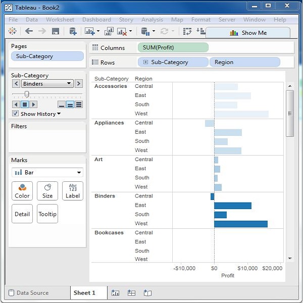
Tableau - Operators
An operator is a symbol that tells the compiler to perform specific mathematical or logical manipulations. Tableau has a number of operators used to create calculated fields and formulas.
Following are the details of the operators that are available and the order (precedence) of operations.
Types of Operator
- General Operators
- Arithmetic Operators
- Relational Operators
- Logical Operators
General Operators
Following table shows the general operators supported by Tableau. These operators act on numeric, character, and date data types.
| Operator | Description | Example |
|---|---|---|
| +(addition) | Adds two numbers. Concatenates two strings. Adds days to dates. | 7 + 3 Profit + Sales 'abc' + 'def' = 'abcdef' #April 15, 2004# + 15 = #April 30, 2004# |
| –(subtraction) | Subtracts two numbers. Subtracts days from dates. | -(7+3) = -10 #April 16, 2004# - 15 = #April 1, 2004# |
Arithmetic Operators
Following table shows the arithmetic operators supported by Tableau. These operators act only on numeric data types.
| Operator | Description | Example |
|---|---|---|
| *(Multiplication) | Numeric multiplication | 23*2 = 46 |
| /(Division) | Numeric division | 45/2 = 22.5 |
| %(modulo) | Reminder of numeric division | 13 % 2 = 1 |
| ^(power) | Raised to the power | 2^3 = 8 |
Comparison Operators
Following table lists the comparison operators supported by Tableau. These operators are used in expressions. Each operator compares two numbers, dates, or strings and returns a Boolean (TRUE or FALSE). Booleans themselves, however, cannot be compared using these operators.
| Operator | Description | Example |
|---|---|---|
| = = or = (Equal to) | Compares two numbers or two strings or two dates to be equal. Returns the Boolean value TRUE if they are, else returns false. | ‘Hello’ = ‘Hello’ 5 = 15/ 3 |
| != or <> (Not equal to) | Compares two numbers or two strings or two dates to be unequal. Returns the Boolean value TRUE if they are, else returns false. | ‘Good’ <> ‘Bad’ 18 != 37 / 2 |
| > (Greater than) | Compares two numbers or two strings or two dates where the first argument is greater than second. Returns the boolean value TRUE if it is the case, else returns false. | [Profit] > 20000 [Category] > ‘Q’ [Ship date] > #April 1, 2004# |
| < (Less than) | Compares two numbers or two strings or two dates where the first argument is smaller than second. Returns the boolean value TRUE if it is the case, else returns false. | [Profit] < 20000 [Category] < ‘Q’ [Ship date] < #April 1, 2004# |
Logical Operators
Following table shows the logical operators supported by Tableau. These operators are used in expressions whose result is a Boolean giving the output as TRUE or FALSE.
| Operator | Description | Example |
|---|---|---|
| AND | If the expressions or Boolean values present on both sides of AND operator is evaluated to be TRUE, then the result is TRUE. Else the result is FALSE. | [Ship Date] > #April 1, 2012# AND [Profit] > 10000 |
| OR | If any one or both of the expressions or Boolean values present on both sides of AND operator is evaluated to be TRUE, then the result is TRUE. Else the result is FALSE. | [Ship Date] > #April 1, 2012# OR [Profit] > 10000 |
| NOT | This operator negates the Boolean value of the expression present after it. | NOT [Ship Date] > #April 1, 2012# |
Operator Precedence
The following table describes the order in which operators are evaluated. The top row has the highest precedence. Operators on the same row have the same precedence. If two operators have the same precedence, they are evaluated from left to right in the formula. Also parentheses can be used. The inner parentheses are evaluated before the outer parentheses.
| Precedence | Operator |
|---|---|
| 1 | –(negate) |
| 2 | ^(power) |
| 3 | *, /, % |
| 4 | +, – |
| 5 | ==, >, <, >=, <=, != |
| 6 | NOT |
| 7 | AND |
| 8 | OR |
Tableau - Functions
Any data analysis involves a lot of calculations. In Tableau, the calculation editor is used to apply calculations to the fields being analyzed. Tableau has a number of inbuilt functions which help in creating expressions for complex calculations.
Following are the description of different categories of functions.
- Number Functions
- String Functions
- Date Functions
- Logical Functions
- Aggregate Functions
Number Functions
These are the functions used for numeric calculations. They only take numbers as inputs. Following are some examples of important number functions.
| Function | Description | Example |
|---|---|---|
| CEILING (number) | Rounds a number to the nearest integer of equal or greater value. | CEILING(2.145) = 3 |
| POWER (number, power) | Raises the number to the specified power. | POWER(5,3) = 125 |
| ROUND (number, [decimals]) | Rounds the numbers to a specified number of digits. | ROUND(3.14152,2) = 3.14 |
String Functions
String Functions are used for string manipulation. Following are some important string functions with examples
| Function | Description | Example |
|---|---|---|
| LEN (string) | Returns the length of the string. | LEN("Tableau") = 7 |
| LTRIM (string) | Returns the string with any leading spaces removed. | LTRIM(" Tableau ") = "Tableau" |
| REPLACE (string, substring, replacement) | Searches the string for substring and replaces it with a replacement. If the substring is not found, the string is not changed. | REPLACE("GreenBlueGreen", "Blue", "Red") = "GreenRedGreen" |
| UPPER (string) | Returns string, with all characters uppercase. | UPPER("Tableau") = "TABLEAU" |
Date Functions
Tableau has a variety of date functions to carry out calculations involving dates. All the date functions use the date_part which is a string indicating the part of the date such as - month, day, or year. Following table lists some examples of important date functions.
| Function | Description | Example |
|---|---|---|
| DATEADD (date_part, increment, date) | Returns an increment added to the date. The type of increment is specified in date_part. | DATEADD ('month', 3, #2004-04-15#) = 2004-0715 12:00:00 AM |
| DATENAME (date_part, date, [start_of_week]) | Returns date_part of date as a string. The start_of_week parameter is optional. | DATENAME('month', #200404-15#) = "April" |
| DAY (date) | Returns the day of the given date as an integer. | DAY(#2004-04-12#) = 12 |
| NOW( ) | Returns the current date and time. | NOW( ) = 2004-04-15 1:08:21 PM |
Logical Functions
These functions evaluate some single value or the result of an expression and produce a boolean output.
| Function | Description | Example |
|---|---|---|
| IFNULL (expression1, expression2) | The IFNULL function returns the first expression if the result is not null, and returns the second expression if it is null. | IFNULL([Sales], 0) = [Sales] |
| ISDATE (string) | The ISDATE function returns TRUE if the string argument can be converted to a date, and FALSE if it cannot. | ISDATE("11/05/98") = TRUE ISDATE("14/05/98") = FALSE |
| MIN(expression) | The MIN function returns the minimum of an expression across all records or the minimum of two expressions for each record. | |
Aggregate Functions
| Function | Description | Example |
|---|---|---|
| AVG(expression) | Returns the average of all the values in the expression. AVG can be used with numeric fields only. Null values are ignored. | |
| COUNT (expression) | Returns the number of items in a group. Null values are not counted. | |
| MEDIAN (expression) | Returns the median of an expression across all records. Median can only be used with numeric fields. Null values are ignored. | |
| STDEV (expression) | Returns the statistical standard deviation of all values in the given expression based on a sample of the population. |
Tableau - Numeric Calculations
Numeric calculations in Tableau are done using a wide range of inbuilt functions available in the formula editor.
In this chapter, we will see how to apply calculations to the fields. The calculations can be as simple as subtracting the values of two fields or applying an aggregate function to a single field.
Following are the steps to create a calculation field and use numeric functions in it.
Create Calculated Field
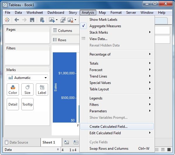
While connected to Sample-superstore, go to the Analysis menu and click ‘Create Calculated Field’, as shown in the following screenshot.
Calculation Editor
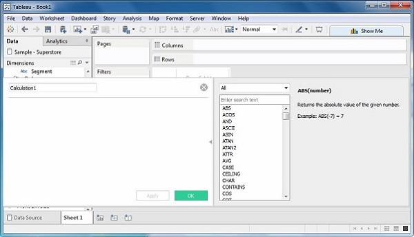
The above step opens a calculation editor which lists all the functions that is available in Tableau. You can change the dropdown value and see only the functions related to numbers.
Create a Formula
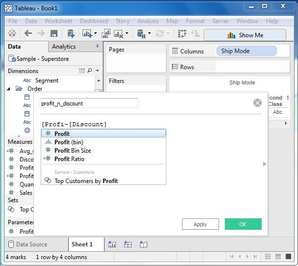
To study the difference between profit and discount for different shipping mode of the products, create a formula subtracting the discount from the profit as shown in the following screenshot. Also, name this field as profit_n_discount.
Using the Calculated Field
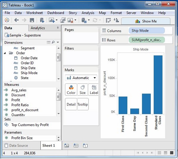
The above calculated field can be used in the view by dragging it to the Rows shelf as shown in the following screenshot. It produces a bar chart showing the difference between profit and discount for different shipping modes.
Applying Aggregate Calculations
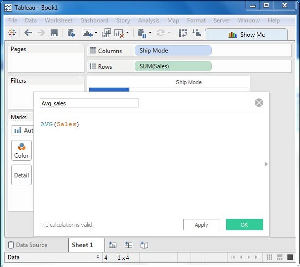
In a similar manner as above, you can create a calculated field using aggregate function. Here, create AVG(sales) values for different ship mode. Write the formula in the calculation editor as shown in the following screenshot.
On clicking OK and dragging the Avg_Sales field to the Rows shelf, you will get the following view.
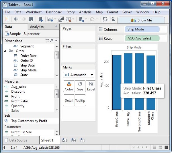
Tableau - String Calculations
In this chapter, you will learn about calculations in Tableau involving Strings. Tableau has many inbuilt string functions, which can be used to do string manipulations such as - comparing, concatenating, replacing few characters from a string, etc. Following are the steps to create a calculation field and use string functions in it.
Create Calculated Field
While connected to Sample superstore, go to the Analysis menu and click ‘Create Calculated Field’ as shown in the following screenshot.

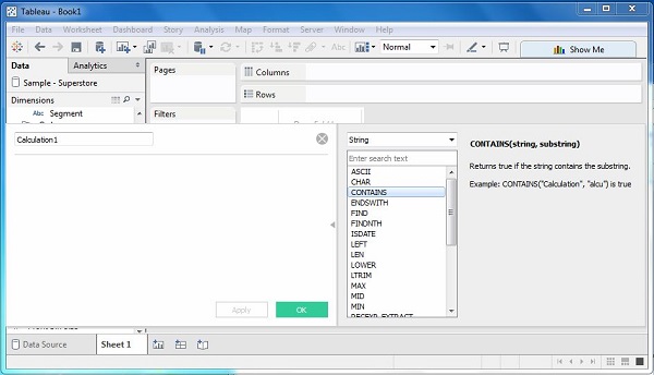
Calculation Editor
The above step opens a calculation editor which lists all the functions that is available in Tableau. You can change the dropdown value and see only the functions related to strings.
Create a Formula
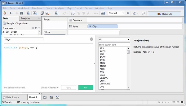
Consider you want to find out the sales in the cities, which contain the letter “o”. For this, create the formula as shown in the following screenshot.
Using the Calculated Field
Now, to see the created field in action, you can drag it to the Rows shelf and drag the Sales field to the Columns shelf. The following screenshot shows the Sales values.
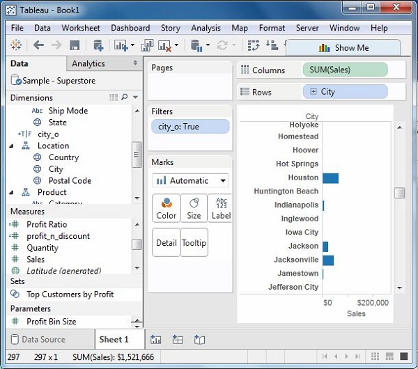
Tableau - Date Calculations
Dates are one of the key fields which is extensively used in most of the data analysis scenarios. Hence, Tableau provides a large number of inbuilt functions involving dates. You can carry out simple date manipulations such as adding or subtracting days from a date. You can also create complex expressions involving dates.
Following are the steps to create a calculation field and use date functions in it.
Create Calculated Field
While connected to Sample superstore, go to the Analysis menu and click ‘Create Calculated Field’, as shown in the following screenshot.

Calculation Editor
The above step opens a calculation editor, which lists all the functions available in Tableau. You can change the dropdown value and see only the functions related to Date.
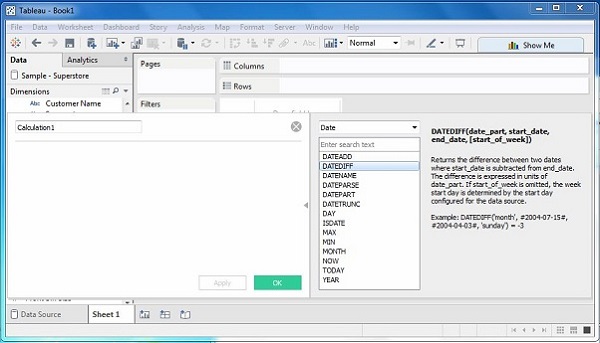
Create a Formula
Now, find out the sales volume along with the difference in the date of sales in months from 21st March 2009. For this, create the formula as shown in the following screenshot.
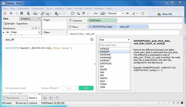
Using the Calculated Field
Now to see the created field in action, you can drag it to the Rows shelf and drag the Sales field to the Columns shelf. Also drag the ship Date with months. The following screenshot shows the Sales values.
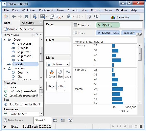
Tableau - Table Calculations
These are the calculations which are applied to the values in the entire table. For example, for calculating a running total or running average, we need to apply a single method of calculation to an entire column. Such calculations cannot be performed on some selected rows.
Table has a feature called Quick Table Calculation, which is used to create such calculations. The steps to be applied in Quick Table calculation are as follows −
Step 1 − Select the measure on which the table calculation has to be applied and drag it to column shelf.
Step 2 − Right-click the measure and choose the option Quick Table Calculation.
Step 3 − Choose one of the following options to be applied on the measure.
- Running Total
- Difference
- Percent Difference
- Percent of Total
- Rank
- Percentile
- Moving Average
- Year to Date (YTD) Total
- Compound Growth Rate
- Year over Year Growth
- Year to Date (YTD) Growth
Example
Let’s calculate the running total of the profits earned for the data source following the above steps. Use the data source named sample – superstore.xls.
Tableau - LOD Expressions
Level of Detail (LOD) expressions are used to run complex queries involving many dimensions at the data source level instead of bringing all the data to Tableau interface. A simple example is adding dimension to an already calculated aggregate value.
Types of LOD
There are three main types of LOD expressions.
FIXED LOD This expression computes values using the specified dimensions without reference to any other dimensions in the view.
INCLUDE LOD This level of detail expressions compute values using the specified dimensions in addition to whatever dimensions are in the view.
EXCLUDE LOD These levels of detail expressions subtract dimensions from the view level of detail.
FIXED Level of Detail Expressions
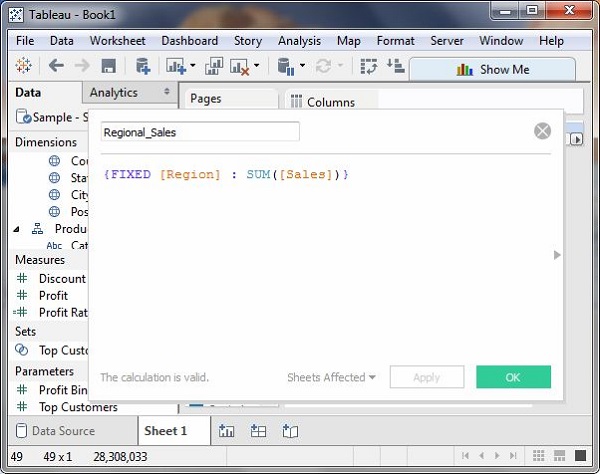
Find the amount of Sales for each state in each region. Here, first create the formula field named Regional Sales using the formula as shown in the following screenshot.
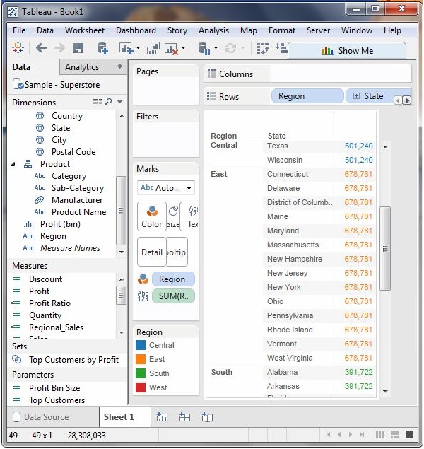
Next, drag the Region and State field to the Rows shelf and the calculated field to the Text shelf under the Marks card. Also drag the Region field to the Color shelf. This produces the following view, which shows a fixed value for different states. That is because we have fixed the dimension as region for the calculation of Sales value.
INCLUDE Level of Detail Expressions
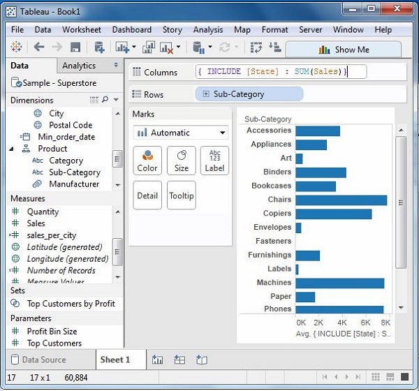
INCLUDE level of detail expressions compute values using the specified dimensions in addition to whatever dimensions are in the view. Calculate the sum of sales per state for each sub-category of products.
For this, drag the Sub-Category field to the Rows shelf. Then, write the expression in the Columns shelf as shown in the following screenshot. It produces the following view which includes both the dimensions in the calculations.
EXCLUDE Level of Detail Expressions
EXCLUDE level of detail expressions specify dimensions to exclude from the view level of detail. Exclude Region from Sales figure calculated for every month. Create the formula as shown in the following screenshot.
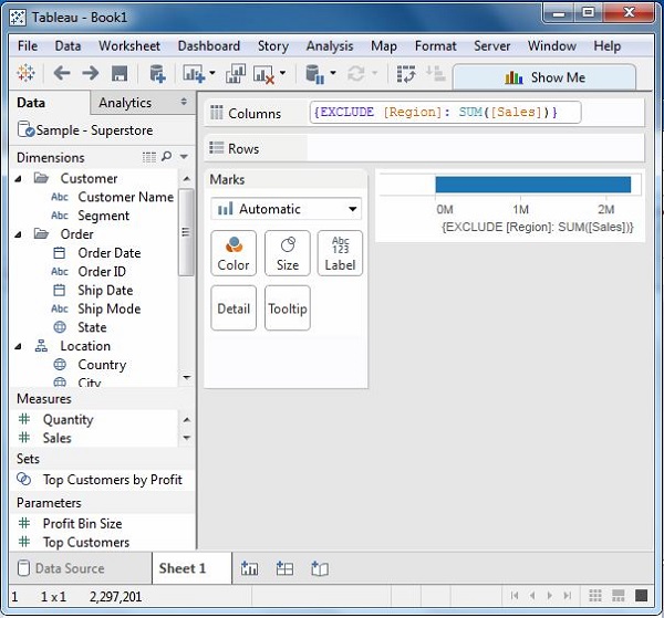
On dragging the relevant fields to the respective shelves, you will get the final view for the EXCLUDE LOD as shown in the following screenshot.
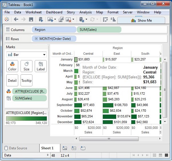
Tableau - Basic Sorting
Sorting of data is a very important feature of data analysis. Tableau allows the sorting of data of the fields, which are called dimensions. There are two ways in which Tableau carries out the sorting.
Computed Sorting is the sort directly applied on an axis using the sort dialog button.
Manual Sorting is used to rearrange the order of dimension fields by dragging them next to each other in an ad hoc fashion.
Computed Sorting
This type of sorting involves choosing a field to be sorted and directly applying the sort using the sort dialog box. You have the option to choose the sort order as ascending or descending and choose the field on which to apply the sort.
Example
Choose Sample-Superstore to apply sorting on the field named discount by using the dimensions order date and Subcategory as shown below. The result shows the name of the sub-categories in a descending order arranged for each year.
Manual Sorting
This is basically changing the order in which the visualization elements appear in the screen. For example, you want to show the sales volume of different product segment in a descending order, however you have your own choice of order. This sort is not as per the exact values of number or text, rather they represent the user’s choice of ordering. Hence, they are called as manual sorting.
In the following example, you move the segment named Home Office, below the segment named Consumer, even though the sales volume of Home Office is the lowest.
Tableau - Basic Filters
Filtering is the process of removing certain values or range of values from a result set. Tableau filtering feature allows both simple scenarios using field values as well as advanced calculation or context-based filters. In this chapter, you will learn about the basic filters available in Tableau.
There are three types of basic filters available in Tableau. They are as follows −
Filter Dimensions are the filters applied on the dimension fields.
Filter Measures are the filters applied on the measure fields.
Filter Dates are the filters applied on the date fields.
Filter Dimensions
These filters are applied on the dimension fields. Typical examples include filtering based on categories of text or numeric values with logical expressions greater than or less than conditions.
Example
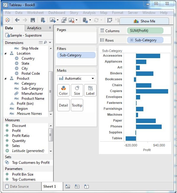
We use the Sample - Superstore data source to apply dimension filters on the sub-category of products. We create a view for showing profit for each sub-category of products according to their shipping mode. For it, drag the dimension field “Sub-Category” to the Rows shelf and the measure field “profit” to the Columns shelf.
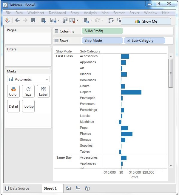
Next, drag the Sub-Category dimension to the Filters shelf to open the Filter dialog box. Click the None button at the bottom of the list to deselect all segments. Then, select the Exclude option in the lower right corner of the dialog box. Finally, select Labels and Storage and then click OK. The following screenshot shows the result with the above two categories excluded.
Filter Measures
These filters are applied on the measure fields. Filtering is based on the calculations applied to the measure fields. Hence, while in dimension filters you use only values to filter, in measures filter you use calculations based on fields.
Example
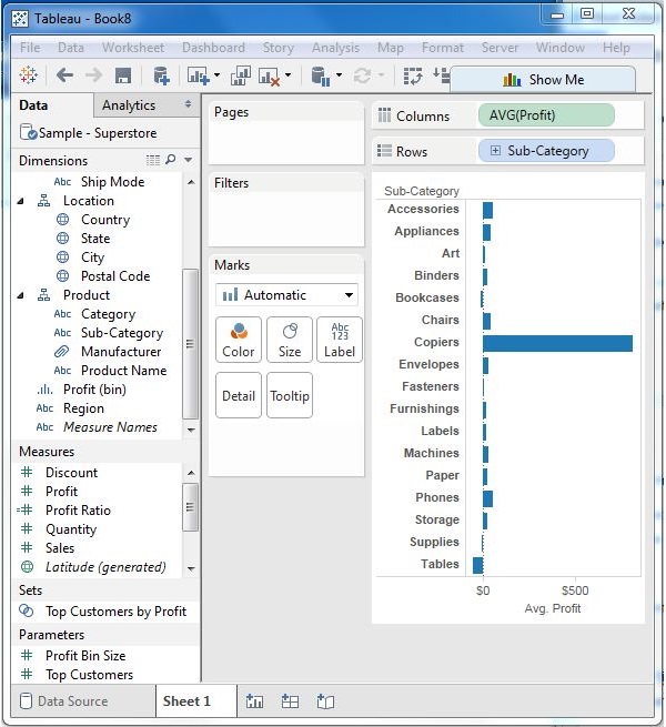
You can use the Sample - Superstore data source to apply dimension filters on the average value of the profits. First, create a view with ship mode and subcategory as dimensions and Average of profit as shown in the following screenshot.
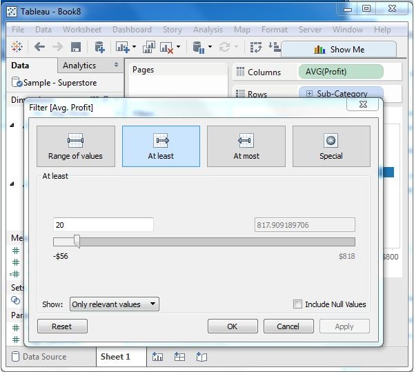
Next, drag the AVG (profit) value to the filter pane. Choose Average as the filter mode. Next, choose "At least" and give a value to filter the rows, which meet these criteria.
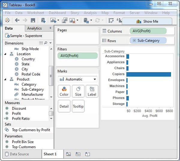
After completion of the above steps, we get the final view below showing only the subcategories whose average profit is greater than 20.
Filter Dates
Tableau treats the date field in three different ways while applying the date field. It can apply filter by taking a relative date as compared to today, an absolute date, or range of dates. Each of this option is presented when a date field is dragged out of the filter pane.
Example
We choose the sample - Superstore data source and create a view with order date in the column shelf and profit in the rows shelf as shown in the following screenshot.
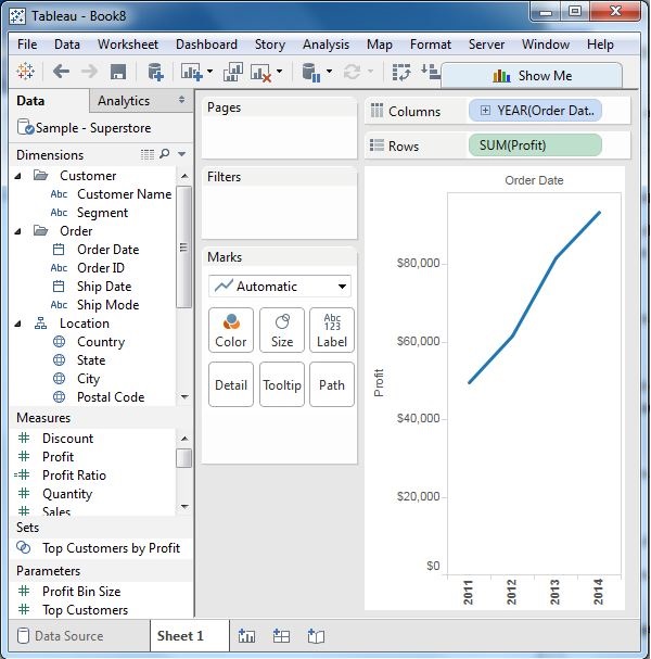
Next, drag the "order date" field to the filter shelf and choose Range of dates in the filter dialog box. Choose the dates as shown in the following screenshot.
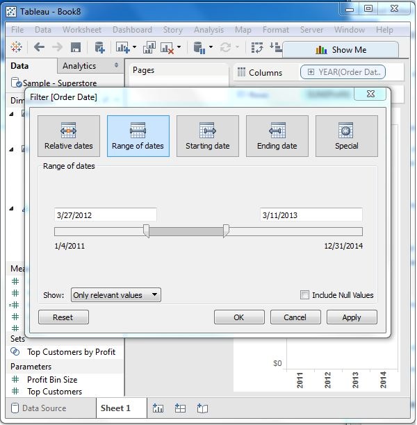
On clicking OK, the final view appears showing the result for the chosen range of dates as seen in the following screenshot.
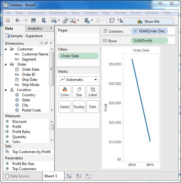
Tableau - Quick Filters
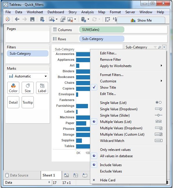
Many filter types in Tableau are quickly available using the right-click option on the dimension or measure. These filters known as Quick filters have enough functionality to solve most of the common filtering needs.
The following screenshot shows how the quick filters are accessed.
Following is a list of various quick filters and their use.
| Filter name | Purpose |
|---|---|
| Single Value (List) | Select one value at a time in a list. |
| Single Value (Dropdown) | Select a single value in a drop-down list. |
| Multiple Values (List) | Select one or more values in a list. |
| Multiple Values (Dropdown) | Select one or more values in a drop-down list. |
| Multiple Values (Custom List) | Search and select one or more values. |
| Single Value (Slider) | Drag a horizontal slider to select a single value. |
| Wildcard Match | Select values containing the specified characters. |
Example
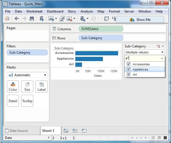
Consider the Sample-Superstore data source to apply some quick filters. In the following example, choose sub-category as the row and sales as the column which by default produces a horizontal bar chart. Next, drag the sub-category field to the filters pane. All the subcategories appear next to the chart. Apply wildcard filtering using the expression a* which selects all subcategory name starting with “a”.
The below screen shows the result of applying this filter where only the sub-categories starting with “A” are displayed.
Clearing the Filter
Once the analysis is complete by applying the filter, remove it by using the clear filter option. For this, go to the filter Pane, right-click on the field name and choose Clear Filter as shown in the following screenshot.
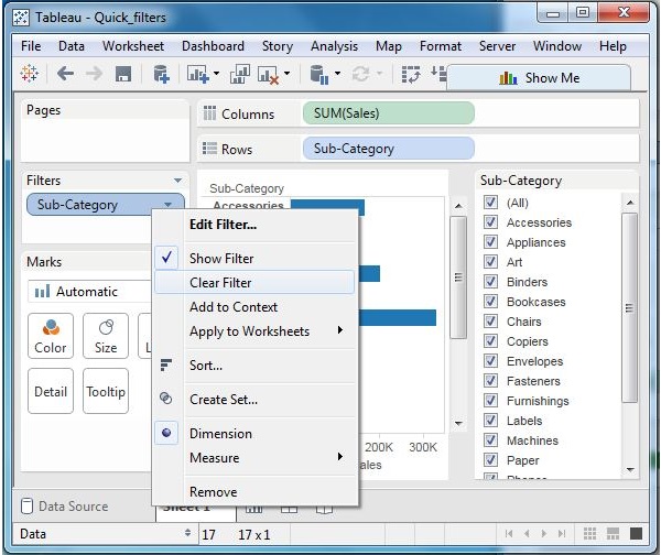
Tableau - Context Filters
The normal filters in Tableau are independent of each other. It means each of the filter reads all the rows from the source data and creates its own result. However, there may be scenarios where you might want the second filter to process only the records returned by the first filter. In such a case, the second filter is known as dependent filters because they process only the data that passes through the context filter. Context Filters serve two main purposes.
Improves performance − If you set a lot of filters or have a large data source, the queries can be slow. You can set one or more context filters to improve the performance.
Creates a dependent numerical or top N filter − You can set a context filter to include only the data of interest, and then set a numerical or a top N filter.
Creating Context Filter
Using the Sample-superstore, find the top 10 Sub-Category of products for the category called Furniture. To achieve this objective, following are the steps.
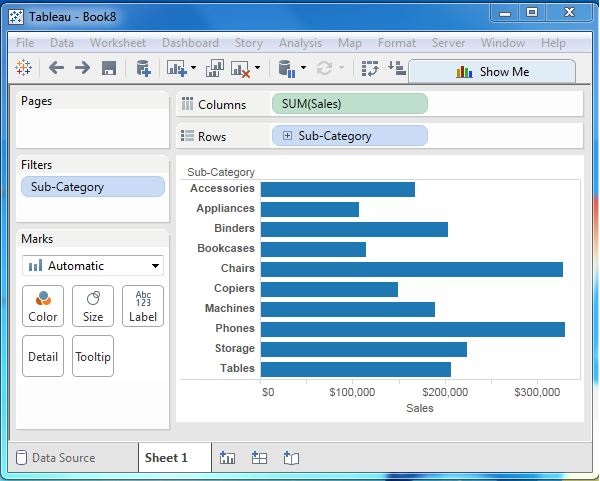
Step 1 − Drag the dimension Sub-Category to the Rows shelf and the measure Sales to the Columns Shelf. Choose the horizontal bar chart as the chart type. Drag the dimension Sub-Category again to the Filters shelf. You will get the following chart.
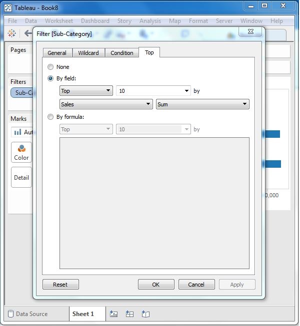
Step 2 − Right-click on the field Sub-Category in the filter shelf and go the fourth tab named Top. Choose the option by field. From the next drop-down, choose the option Top 10 by Sales Sum as shown in the following screenshot.
Step 3 − Drag the dimension Category to the filter shelf. Right-click to edit and under the general tab choose Furniture from the list. As you can see the result shows three subcategory of products.
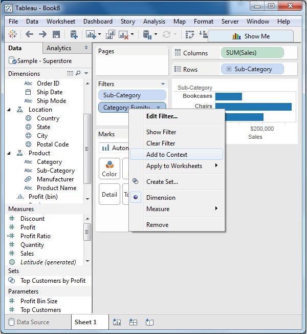
Step 4 − Right-click the Category: Furniture filter and select the option Add to Context. This produces the final result, which shows the subcategory of products from the category Furniture which are among the top 10 subcategories across all the products.
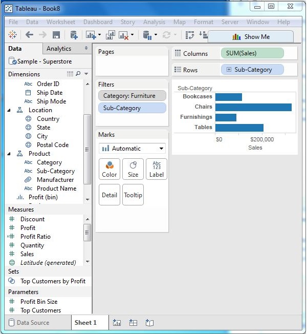
Tableau - Condition Filters
One of the important filtering options in Tableau is to apply some conditions to already existing filters. These conditions can be very simple like finding only those sales which are higher than a certain amount or it can be a complex one based on a certain formula. The conditions can also be applied to create a range filter.
Creating a Condition Filter
Using the Sample-superstore, let's find that sub-category of products across all segments whose sales exceed one million. To achieve this objective, following are the steps.
Step 1 − Drag the dimension segment and the measure Sales to the Column shelf. Next, drag the dimension Sub-Category to the Rows shelf. Choose the horizontal bar chart option. You will get the following chart.
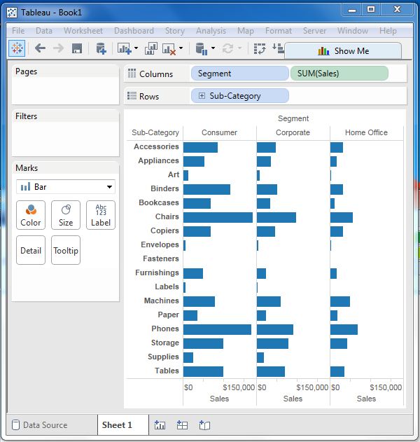
Step 2 − Drag the dimension Sub-Category to the Filters Shelf. Right-click to edit and go to the tab Condition. Here, choose the radio option by field. From the drop-down, select Sales, Sum and greater than equal to symbol specifying the value 100000.
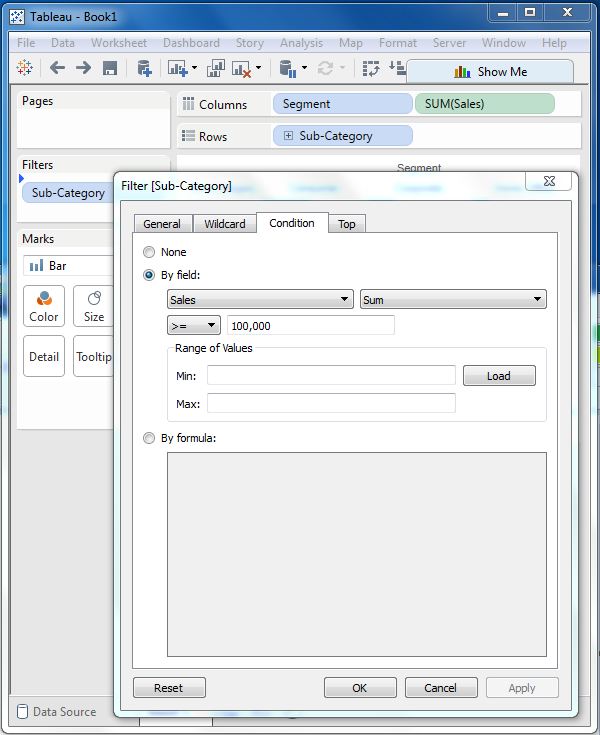
On completion of the above two steps, we get a chart which shows only those subcategory of products, which have the required amount of sale. Also this is shown for all the available segments where the condition is met.
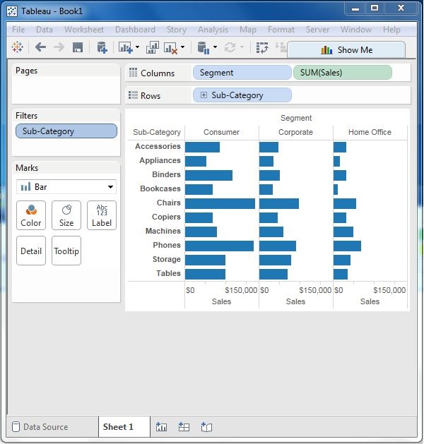
Tableau - Top Filters
The Top option in Tableau filter is used to limit the result set from a filter. For example, from a large set of records on sales you want only the top 10 values. You can apply this filter using the inbuilt options for limiting the records in many ways or by creating a formula. In this chapter, you will explore the inbuilt options.
Creating a Top Filter
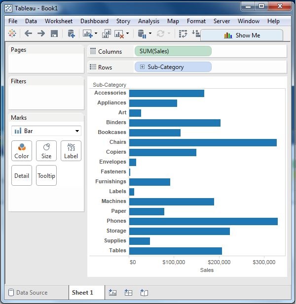
Using the Sample-superstore, find the sub-category of products which represents the top 5 sales amount. To achieve this objective, following are the steps.
Step 1 − Drag the dimension Sub-Category to the Rows shelf and the Measure Sales to the Columns shelf. Choose the horizontal bar as the chart type. Tableau shows the following chart.
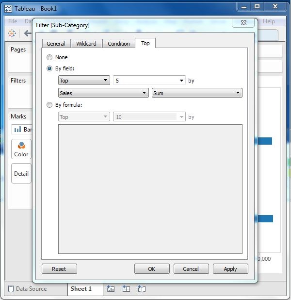
Step 2 − Right-click on the field Sub-Category and go to the tab named Top. Here, choose the second radio option by field. From the drop-down, choose the option Top 5 by Sum of Sales.
On completion of the above step, you will get the following chart, which shows the top 5 Sub-Category of products by sales.
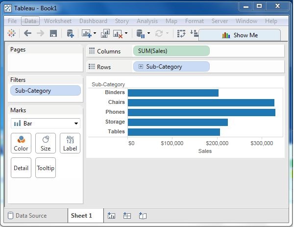
Tableau - Filter Operations
Any data analysis and visualization work involves the use of extensive filtering of data. Tableau has a very wide variety of filtering options to address these needs. There are many inbuilt functions for applying filters on the records using both dimensions and measures. The filter option for measures offers numeric calculations and comparison. The filter option for dimension offers choosing string values from a list or using a custom list of values. In this chapter, you will learn about the various options as well as the steps to edit and clear the filters.
Creating Filters
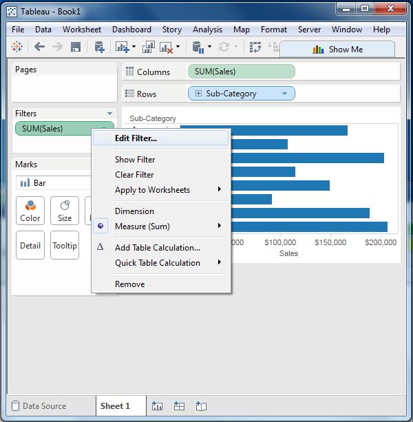
Filters are created by dragging the required field to the Filters shelf located above the Marks card. Create a horizontal bar chart by dragging the measure sales to the Columns shelf and the dimension Sub-Category to the Rows shelf. Again drag the measure sales into the Filters shelf. Once this filter is created, right-click and choose the edit filter option from the pop-up menu.
Creating Filters for Measures
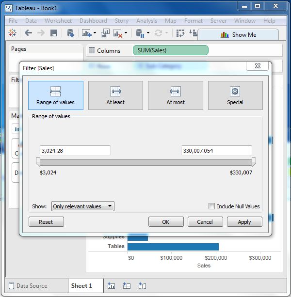
Measures are numeric fields. So, the filter options for such fields involve choosing values. Tableau offers the following types of filters for measures.
Range of Values − Specifies the minimum and maximum values of the range to include in the view.
At Least − Includes all values that are greater than or equal to a specified minimum value.
At Most − Includes all values that are less than or equal to a specified maximum value.
Special − Helps you filter on Null values. Include only Null values, Non-null values, or All Values.
Following worksheet shows these options.
Creating Filters for Dimensions
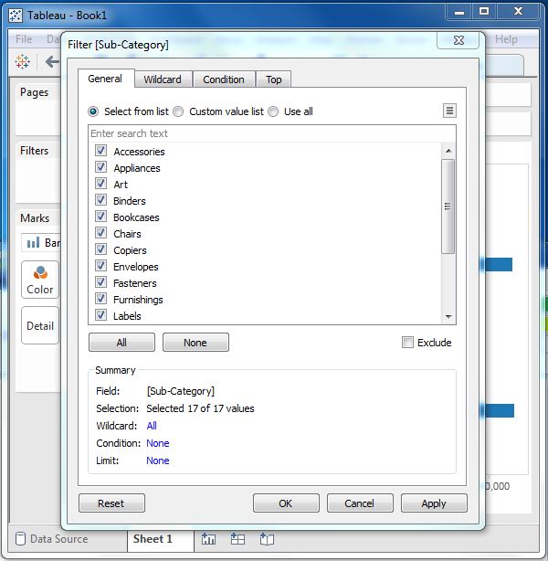
Dimensions are descriptive fields having values which are strings. Tableau offers the following types of filters for dimensions.
General Filter − allows to select specific values from a list.
Wildcard Filter − allows to mention wildcards like cha* to filter all string values starting with cha.
Condition Filter − applies conditions such as sum of sales.
Top Filter − chooses the records representing a range of top values.
Following worksheet shows these options.
Clearing Filters
Filters can be easily removed by choosing the clear filter option as shown in the following screenshot.
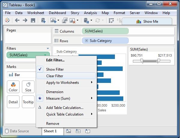
Tableau - Bar Chart
A bar chart represents data in rectangular bars with the length of the bar proportional to the value of the variable. Tableau automatically produces a bar chart when you drag a dimension to the Row shelf and measure to the Column shelf. We can also use the bar chart option present in the Show Me button. If the data is not appropriate for bar chart, then this option will be automatically greyed out.
In Tableau, various types of bar charts can be created by using a dimension and a measure.
Simple Bar Chart
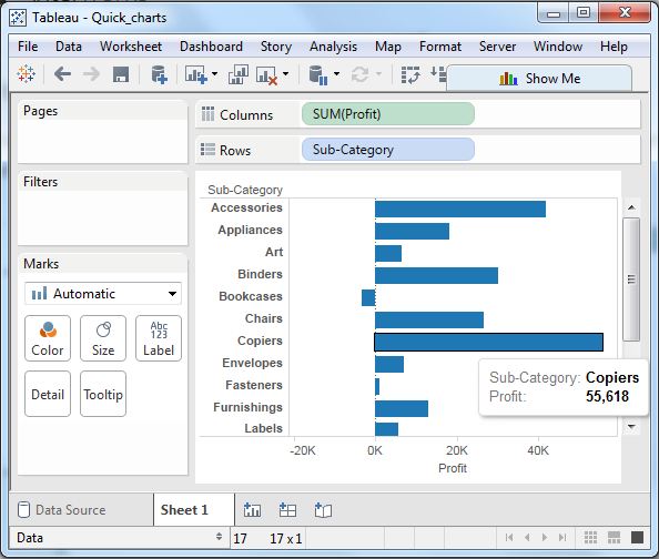
From the Sample-Superstore, choose the dimension, take profit to the columns shelf and Sub-Category to the rows shelf. It automatically produces a horizontal bar chart as shown in the following screenshot. In case, it does not, you can choose the chart type from the Show Me tool to get the following result.
Bar Chart with Color Range
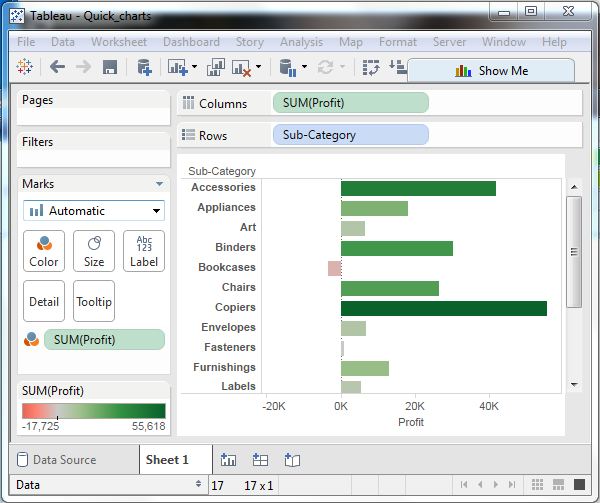
You can apply colors to the bars based on their ranges. The longer bars get darker shades and the smaller bars get the lighter shades. To do this, drag the profit field to the color palette under the Marks Pane. Also note that, it produces a different color for negative bars.
Stacked Bar Chart
You can add another dimension to the above bar chart to produce a stacked bar chart, which shows different colors in each bar. Drag the dimension field named segment to the Marks pane and drop it in colors. The following chart appears which shows the distribution of each segment in each bar.
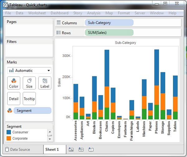
Tableau - Line Chart
In a line chart, a measure and a dimension are taken along the two axes of the chart area. The pair of values for each observation becomes a point and the joining of all these points create a line showing the variation or relationship between the dimensions and measures chosen.
Simple Line Chart
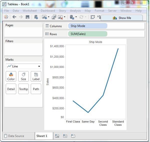
Choose one dimension and one measure to create a simple line chart. Drag the dimension Ship Mode to Columns Shelf and Sales to the Rows shelf. Choose the Line chart from the Marks card. You will get the following line chart, which shows the variation of Sales for different Ship modes.
Multiple Measure Line Chart
You can use one dimension with two or more measures in a line chart. This will produce multiple line charts, each in one pane. Each pane represents the variation of the dimension with one of the measures.
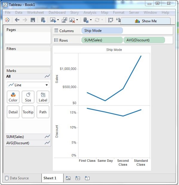
Line Chart with Label
Each of the points making the line chart can be labeled to make the values of the measure visible. In this case, drop another measure Profit Ratio into the labels pane in the Marks card. Choose average as the aggregation and you will get the following chart showing the labels.
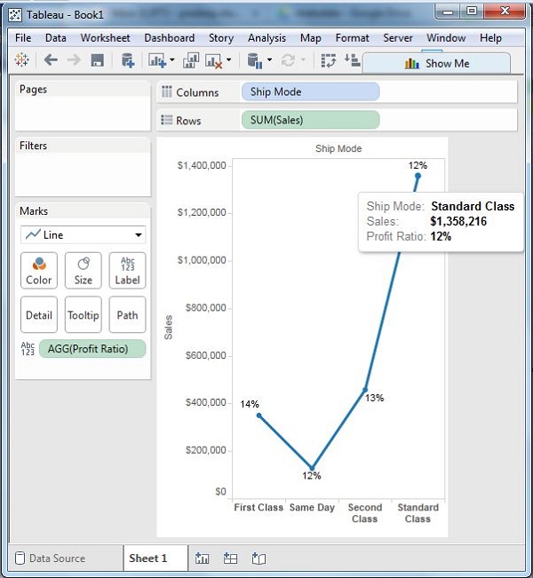
Tableau - Pie Chart
A pie chart represents data as slices of a circle with different sizes and colors. The slices are labeled and the numbers corresponding to each slice is also represented in the chart. You can select the pie chart option from the Marks card to create a pie chart.
Simple Pie Chart
Choose one dimension and one measure to create a simple pie chart. For example, take the dimension named region with the measure named profit. Drop the Region dimension in the colors and label marks. Drop the Profit measure into the size mark. Choose the chart type as Pie. The following chart appears which shows the 4 regions in different colors.
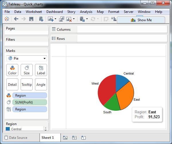
Drill-Down Pie Chart
You can choose a dimension with hierarchy and as you go deeper into the hierarchy, the chart changes reflect the level of the dimension chosen. In the following example, we take the dimension Sub-Category which has two more levels - Manufacturer and Product Name. Take the measure profit and drop it to the Labels mark. The following pie chart appears which shows the values for each slice.
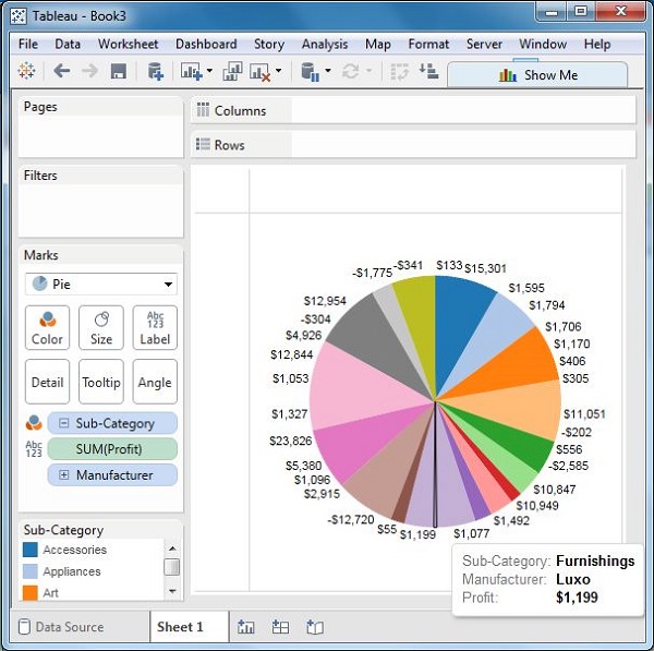
Going one more level into the hierarchy, we get the manufacturer as the label and the above pie chart changes to the following one.
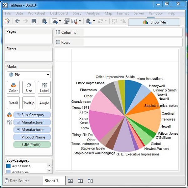
Tableau - Crosstab
A crosstab chart in Tableau is also called a Text table, which shows the data in textual form. The chart is made up of one or more dimensions and one or more measures. This chart can also show various calculations on the values of the measure field such as running total, percentage total, etc.
Simple Crosstab
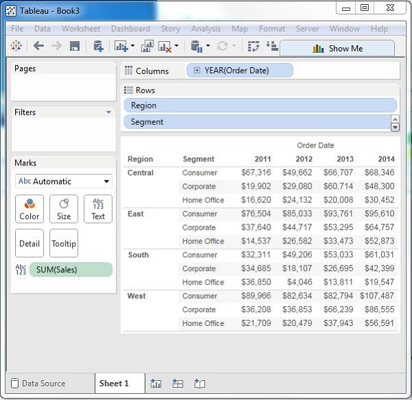
Using the Sample-superstore, let's plan to get the amount of sales for each segment in each region. You need to display this data for each year using the order dates available. To achieve this objective, following are the steps.
Step 1 − Drag and drop the dimension order date to the columns shelf.
Step 2 − Drag and drop the dimensions region and segment to the rows shelf.
Step 3 − Pull the measure Sales to the labels Shelf under Marks.
The following chart appears which shows the Crosstab.
Crosstab - Color Encoded
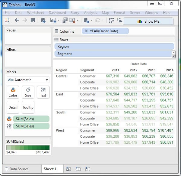
You can get the values color encoded in the crosstab chart by dropping the measure field into the Color shelf as shown in the following screenshot. This color coding shows the strength of the color depending on the value of the measure. The larger values have a darker shade than the lighter values.
Crosstab with Row Percentage
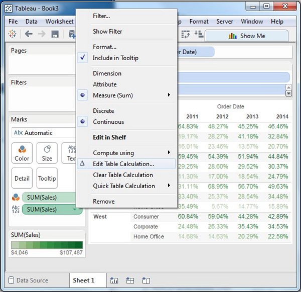
In addition to the color encoding, you can also get calculations applied to the values from the measure. In the following example, we apply the calculation for finding the percentage total of sales in each row instead of only the sales figures. For this, right-click on SUM (Sales) present in the marks card and choose the option Add Table Calculation. Then, choose the percent of total and summarize it as Table (Across).
On clicking OK in the screen above, you will find the crosstab chart created with percentage values as shown in the following screenshot.
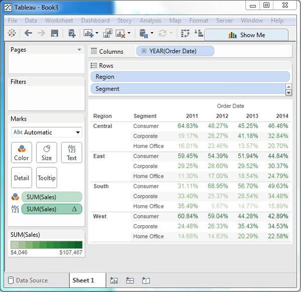
Tableau - Scatter Plot
As the name suggests, a scatter plot shows many points scattered in the Cartesian plane. It is created by plotting values of numerical variables as X and Y coordinates in the Cartesian plane. Tableau takes at least one measure in the Rows shelf and one measure in the Columns shelf to create a scatter plot. However, we can add dimension fields to the scatter plot which play a role in marking different colors for the already existing points in the scatter graph.
Simple Scatter Plot
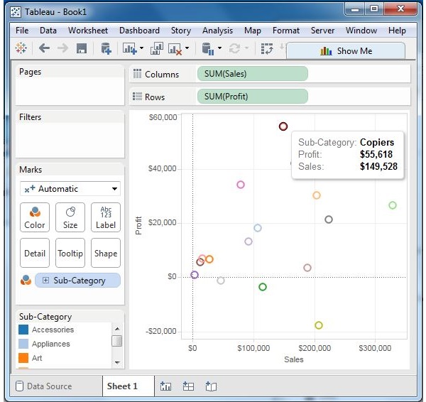
Using the Sample-superstore, let's aim to find the variation of sales and profit figures as the two axes of the Cartesian plane is distributed according to their Sub-Category. To achieve this objective, following are the steps.
Step 1 − Drag and drop the measure Sales to the Columns shelf.
Step 2 − Drag and drop the measure Profit to the Rows shelf.
Step 3 − Pull the dimension Sub-Category to the labels Shelf under Marks.
The following chart appears which shows how profit and sales is distributed across the Sub-Category of products.
Scatter Plot - Color Encoded
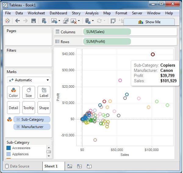
You can get the values color encoded by dragging the dimension Sub-Category to the color Shelf under the Marks card. This chart shows the scatter points with different color for each point.
Drill-Down Scatter Plot
The same scatter plot can show different values when you choose a dimension with hierarchy. In the following example, we expand the Sub-Category field to show the scatter plot values for the Manufacturers.
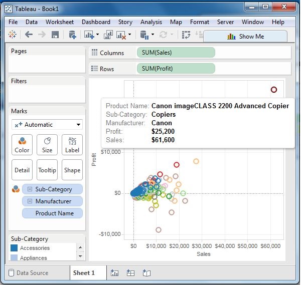
Tableau - Bubble Chart
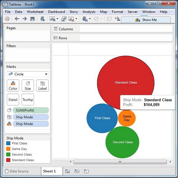
Bubble charts display data as a cluster of circles. Each of the values in the dimension field represents a circle whereas the values of measure represent the size of those circles. As the values are not going to be presented in any row or column, you can drag the required fields to different shelves under the marks card.
Simple Bubble Chart
Using the Sample-superstore, let's plan to find the size of profits for different ship mode. To achieve this objective, following are the steps.
Step 1 − Drag and drop the measure profit into the Size shelf under Marks card.
Step 2 − Drag and drop the dimension ship mode into the Labels shelf under Marks card.
Step 3 − Pull the dimension ship mode to the Colors shelf under Marks card.
The following chart appears.
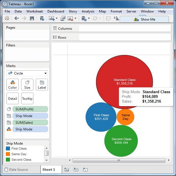
Bubble Chart with Measure Values
You can also show the values of the measure field which decides the size of the circles. To do this, drag the sales measure into the Labels shelf. The following chart appears.
Bubble Chart with Measure Colors
Instead of coloring each circle with a different color, you can use a single color with different shades. For this, drag the measure sales into the color shelf. The higher values represent darker shades while the smaller values represent lighter shades.
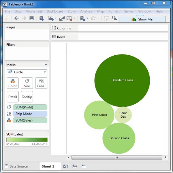
Tableau - Bullet Graph
A bullet chart is a variation of Bar chart. In this chart, we compare the value of one measure with another measure in the context of finding the variation in the first measure within a range of variations in the second measure. It is like two bars drawn upon one another to indicate their individual values at the same position in the graph. It can be thought of as combining two graphs as one to view a comparative result easily.
Creating Bullet Graph
Using the Sample-superstore, plan to find the size of profits for the respective sales figures in each Sub-Category. To achieve this objective, following are the steps.
Step 1 − Drag and drop the dimension Sub-Category from the data pane into the column shelf.
Step 2 − Drag and drop the measures Profit and Sales to the Rows shelf.
The following chart appears which shows the two measures as two separate categories of bar charts, each representing the values for sub-categories.
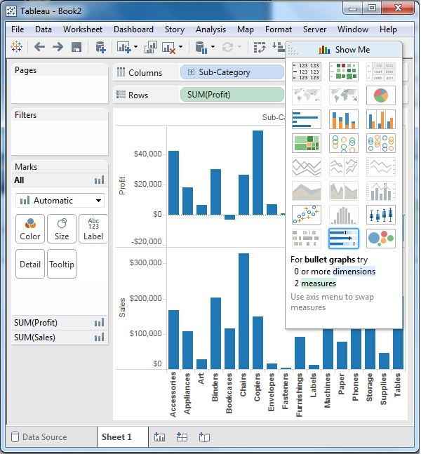
Step 3 − Drag the sales measure to the Marks card. Using Show Me, choose the bullet graph option. The following chart shows the bullet graph.
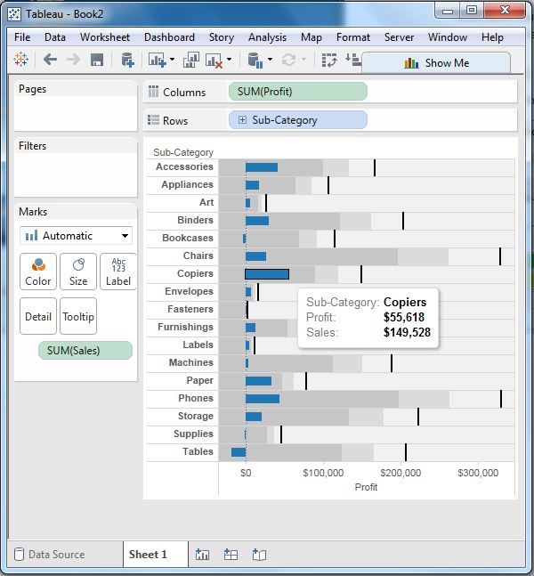
Tableau - Box Plot
The box plots are also known as a box-and-whisker plots. They show the distribution of values along an axis. Boxes indicate the middle 50 percent of the data which is, the middle two quartiles of the data's distribution. The remaining 50 percent of data on both sides is represented by lines also called whiskers, to display all points within 1.5 times the interquartile range, which is all points within 1.5 times the width of the adjoining box, or all points at the maximum extent of the data.
The Box Plots take one or more measures with zero or more dimensions.
Creating a Box Plot
Using the Sample-superstore, plan to find the size of profits for the respective category for each Ship mode values. To achieve this objective, following are the steps.
Step 1 − Drag and drop the dimension category to the Columns shelf and profit to the Rows shelf. Also drag the dimension Ship mode to the right of Category in Columns shelf.
Step 2 − Choose Box-and-Whisker plot from Show Me. The following chart appears which shows the box plots. Here, Tableau automatically reassigns the ship mode to the Marks card.
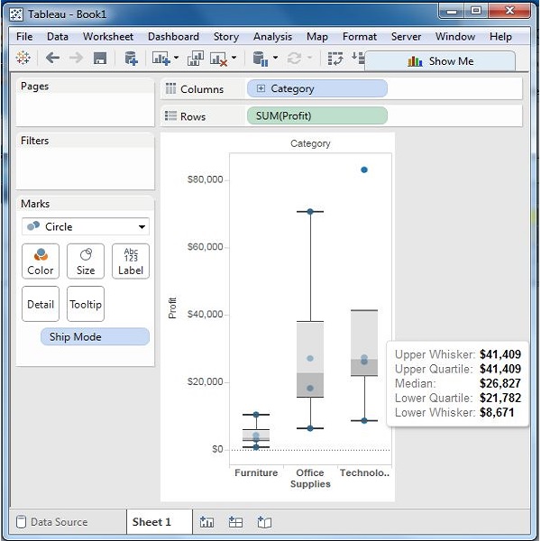
Box Plot with Two Dimensions
You can create box plots with two dimensions by adding another dimension to the Column shelf. In the above chart, add the region dimension to the Column shelf. This produces a chart which shows the box plots for each region.
Tableau - Tree Map
The tree map displays data in nested rectangles. The dimensions define the structure of the tree map and measures define the size or color of the individual rectangle. The rectangles are easy to visualize as both the size and shade of the color of the rectangle reflect the value of the measure.
A Tree Map is created using one or more dimension with one or two measures.
Creating a Tree Map
Using the Sample-superstore, plan to find the size of profits for each Ship mode values. To achieve this objective, following are the steps.
Step 1 − Drag and drop the measure profit two times to the Marks Card. Once to the Size shelf and again to the Color shelf.
Step 2 − Drag and drop the dimension ship mode to the Label shelf. Choose the chart type Tree Map from Show Me. The following chart appears.
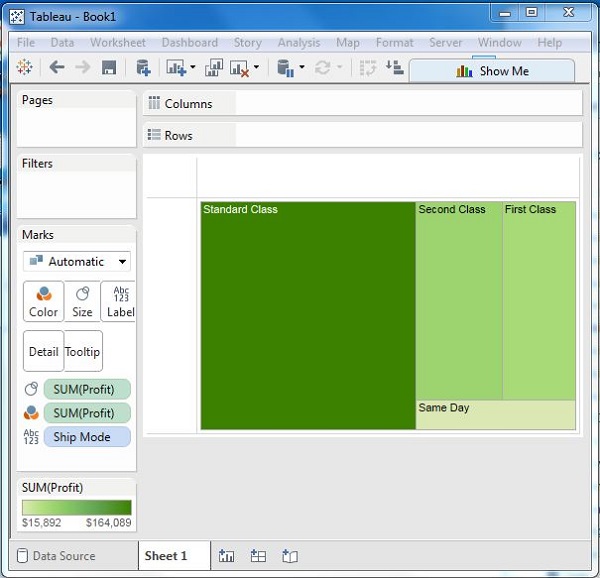
Tree Map with Two Dimensions
You can add the dimension Region to the above Tree map chart. Drag and drop it twice. Once to the Color shelf and again to the Label shelf. The chart that appears will show four outer boxes for four regions and then the boxes for ship modes nested inside them. All the different regions will now have different colors.
Tableau - Bump Chart
A Bump Chart is used to compare two dimensions against each other using one of the Measure value. They are very useful for exploring the changes in Rank of a value over a time dimension or place dimension or some other dimension relevant to the analysis.
The Bump Chart takes two dimensions with zero or more measures.
Creating a Bump Chart
Using the Sample-superstore, plan to find the variation of ship mode of products with the variation of the Sub-Category. To achieve this objective, following are the steps.
Step 1 − Drag and drop the dimension Sub-Category to the Columns shelf. Also drag the dimension Ship mode to the Color shelf under Marks card. Leave the chart type to Automatic. The following chart appears.
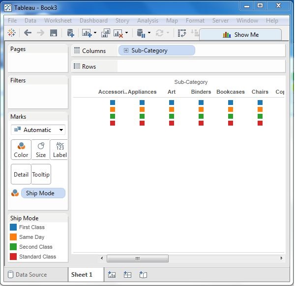
Step 2 − Next, create a calculated field called Rank. Go to Analysis → Create Calculated Field. Use Rank as the field name and write the expression index () in the calculation area. It is an inbuilt function that creates an index for the current row in the partition. Click OK and the new field will be visible in the measures section. Right-click on the field Rank and convert it to discrete.
Step 3 − Drag Rank to the Rows shelf. The following chart appears which shows the dimension Sub-Category with each ship mode arranged in an increasing order of their Rank value.
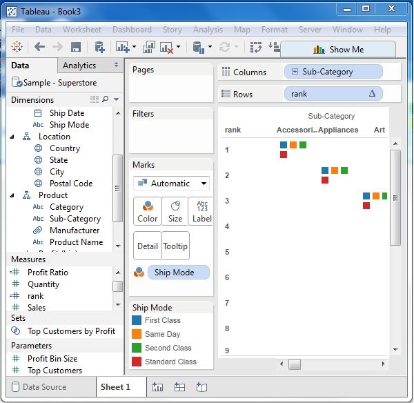
Step 4 − Apply some more calculation to the rank field using the measure Profit. Rightclick on Rank and choose Edit Table calculation. Choose the sorting by the field profit using partition by Sub-Category and addressed by ship mode. The following screenshot shows the calculations applied.
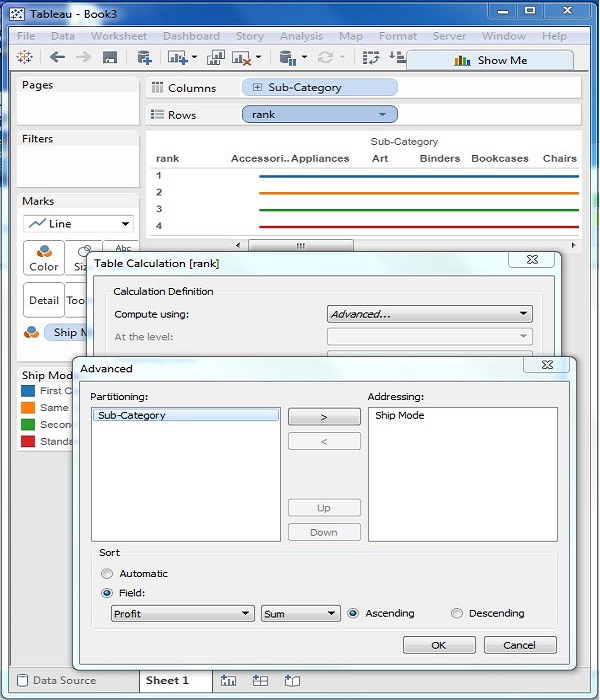
On completion of the above steps, you will get the bump chart as shown in the following screenshot. It shows the variation of profit for each ship mode across various subcategories.
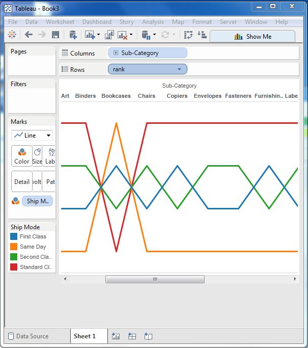
Tableau - Gantt Chart
A Gantt chart shows the progress of the value of a task or resource over a period of time. It is extensively used in project management and other types of variation study over a period of time. Thus, in Gantt chart, time dimension is an essential field.
The Gantt chart takes at least a dimension and a measure in addition to the time dimension.
Creating a Gantt Chart
Using the Sample-superstore, plan to find the variation of quantities of different SubCategory of products according to their ship mode over a range of time. To achieve this objective, following are the steps.
Step 1 − Drag the dimension order date to the Columns shelf and Sub-Category to the Rows shelf. Next, add the order date to the Filters shelf. Right-click on order date to convert it to the exact date values as shown in the following screenshot.
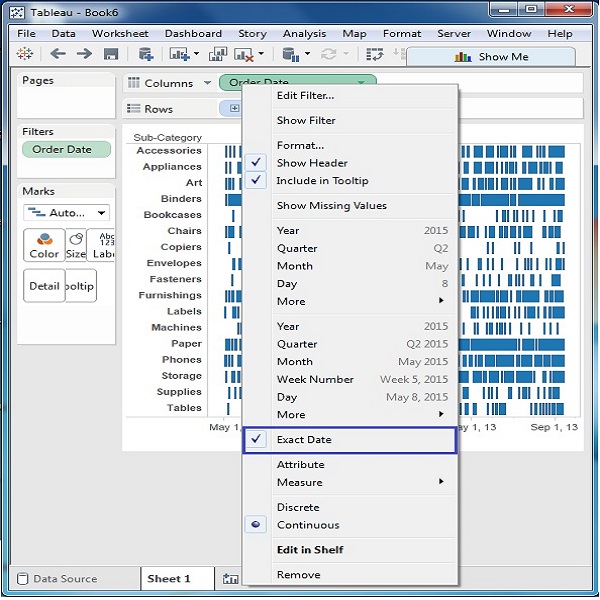
Step 2 − Edit the filter condition to select a range of dates. It is because you want individual date values and there is a very large number of dates in the data. The range is created as shown in the following screenshot.
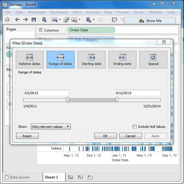
Step 3 − Drag the dimension ship mode to the Color shelf and the measure quantity to the Size shelf under the Marks card. This produces the Gantt chart as shown in the following screenshot.
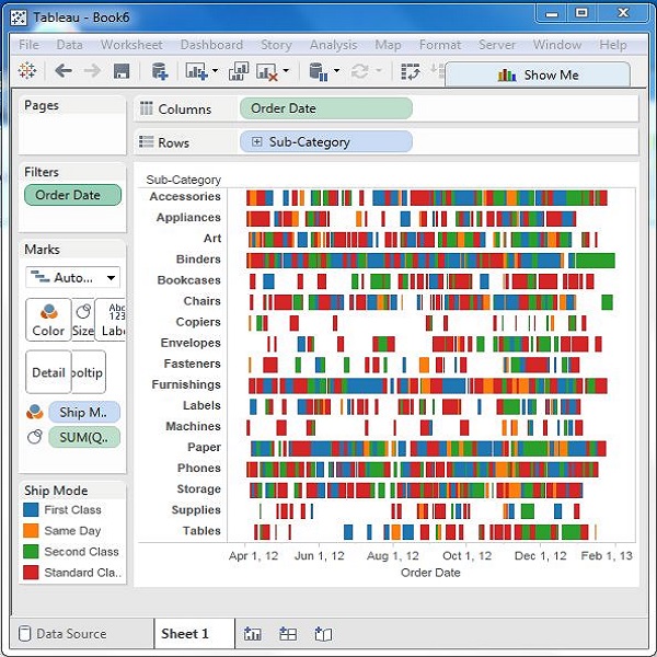
Tableau - Histogram
A histogram represents the frequencies of values of a variable bucketed into ranges. Histogram is similar to bar chart but it groups the values into continuous ranges. Each bar in histogram represents the height of the number of values present in that range.
Tableau creates a histogram by taking one measure. It creates an additional bin field for the measure used in creating a histogram.
Creating a Histogram
Using the Sample-superstore, plan to find the quantities of sales for different regions. To achieve this, drag the Measure named Quantity to the Rows shelf. Then open Show Me and select the Histogram chart. The following diagram shows the chart created. It shows the quantities automatically bucketed into values ranging from 0 to 4811 and divided into 12 bins.
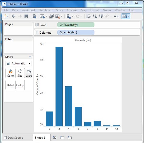
Creating a Histogram with Dimension
You can also add Dimensions to Measures to create histograms. This will create a stacked histogram. Each bar will have stacks representing the values of the dimension. Following the steps of the above example, add the Region Dimension to the color Shelf under Marks Card. This creates the following histogram where each bar also includes the visualization for different regions.
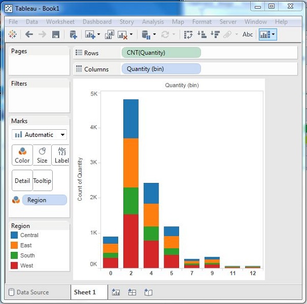
Tableau - Motion Charts
Motion charts show data using the X and Y-axes, displaying changes over time by showing the movement of data points within the defined space as well as changes in the color of the lines. The main advantage of motion chart is to view the entire trail of how the data has changed over time and not just a snapshot of the data.
Tableau needs one Time Dimension and one Measure to create a Motion chart.
Creating a Motion Chart
Using the Sample-superstore, plan to find the variation of Profits over the months. To achieve this objective, following are the steps.
Step 1 − Drag the Dimension Order Date to the Columns Shelf. Drag it again to the Pages Shelf. In the Pages shelf, right-click on the Order Date and choose Month. Then drag the measure Profit to the Rows Shelf. The following chart appears.
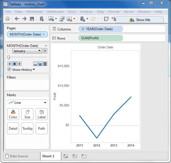
Step 2 − Put a check mark on the box next to Show History and then click on the dropdown arrow next to it. For “Marks to Show History For” select “All”. Then under “Show”, select “Both”. Selecting “Marks” shows only the points and selecting “Trails” shows only the line. Click the Play button. The following chart appears.
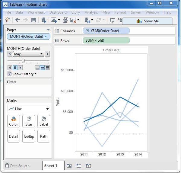
Step 3 − Allowing the chart to run from January to December will create the chart which shows how the profits have varied over each month for all the years. Note that as the data changes the recent months get a darker shade of color and the historical data gets a lighter shade of color.
Finally, you will get the following chart.
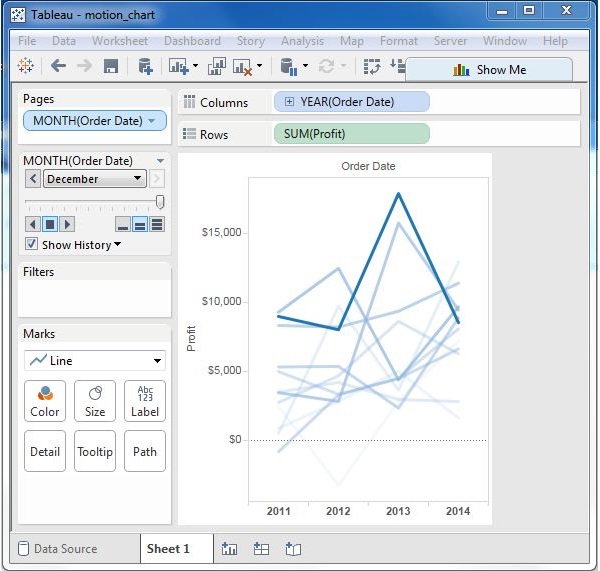
Tableau - Waterfall Charts
Waterfall charts effectively display the cumulative effect of sequential positive and negative values. It shows where a value starts, ends and how it gets there incrementally. So, we are able to see both the size of changes and difference in values between consecutive data points.
Tableau needs one Dimension and one Measure to create a Waterfall chart.
Creating a Waterfall Chart
Using the Sample-superstore, plan to find the variation of Sales for each Sub-Category of Products. To achieve this objective, following are the steps.
Step 1 − Drag the Dimension Sub-Category to the Columns shelf and the Measure Sales to the Rows shelf. Sort the data in an ascending order of sales value. For this, use the sort option appearing in the middle of the vertical axis when you hover the mouse over it. The following chart appears on completing this step.
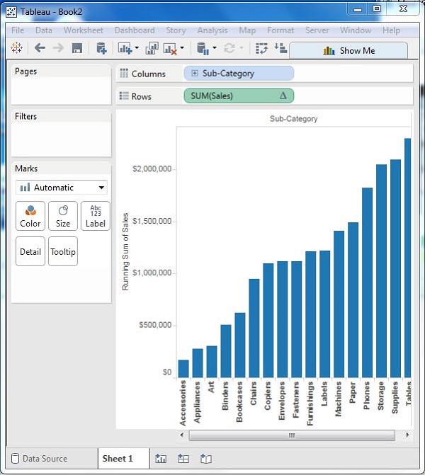
Step 2 − Next, right-click on the SUM (Sales) value and select the running total from the table calculation option. Change the chart type to Gantt Bar. The following chart appears.
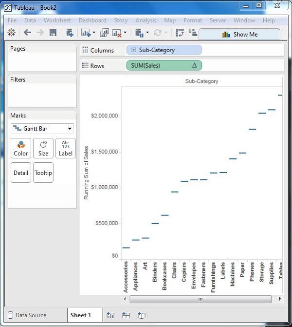
Step 3 − Create a calculated field named -sales and mention the following formula for its value.
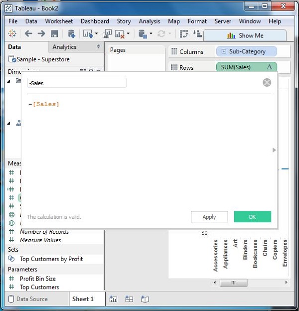
Step 4 − Drag the newly created calculated field (-sales) to the size shelf under Marks Card. The chart above now changes to produce the following chart which is a Waterfall chart.
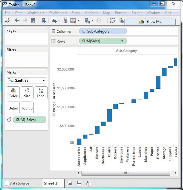
Waterfall Chart with Color
Next, give different color shades to the bars in the chart by dragging the Sales measure to the Color shelf under the Marks Card. You get the following waterfall chart with color.
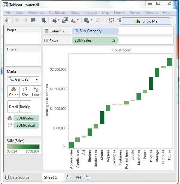
Tableau - Dashboard
A dashboard is a consolidated display of many worksheets and related information in a single place. It is used to compare and monitor a variety of data simultaneously. The different data views are displayed all at once. Dashboards are shown as tabs at the bottom of the workbook and they usually get updated with the most recent data from the data source. While creating a dashboard, you can add views from any worksheet in the workbook along with many supporting objects such as text areas, web pages, and images.
Each view you add to the dashboard is connected to its corresponding worksheet. So when you modify the worksheet, the dashboard is updated and when you modify the view in the dashboard, the worksheet is updated.
Creating a Dashboard
Using the Sample-superstore, plan to create a dashboard showing the sales and profits for different segments and Sub-Category of products across all the states. To achieve this objective, following are the steps.
Step 1 − Create a blank worksheet by using the add worksheet icon located at the bottom of the workbook. Drag the dimension Segment to the columns shelf and the dimension Sub-Category to the Rows Shelf. Drag and drop the measure Sales to the Color shelf and the measure Profit to the Size shelf. This worksheet is referred as the Master worksheet. Right-click and rename this worksheet as Sales_Profits. The following chart appears.
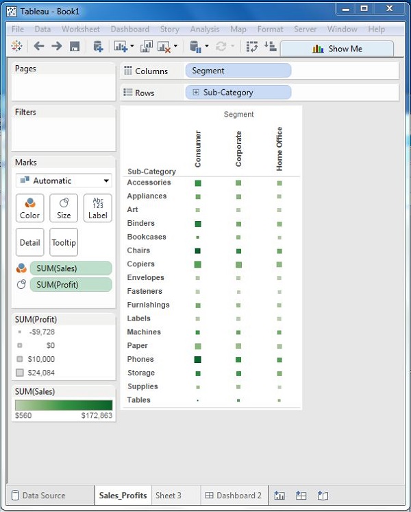
Step 2 − Create another sheet to hold the details of the Sales across the States. For this, drag the dimension State to the Rows shelf and the measure Sales to the Columns shelf as shown in the following screenshot. Next, apply a filter to the State field to arrange the Sales in a descending order. Right-click and rename this worksheet as Sales_state.
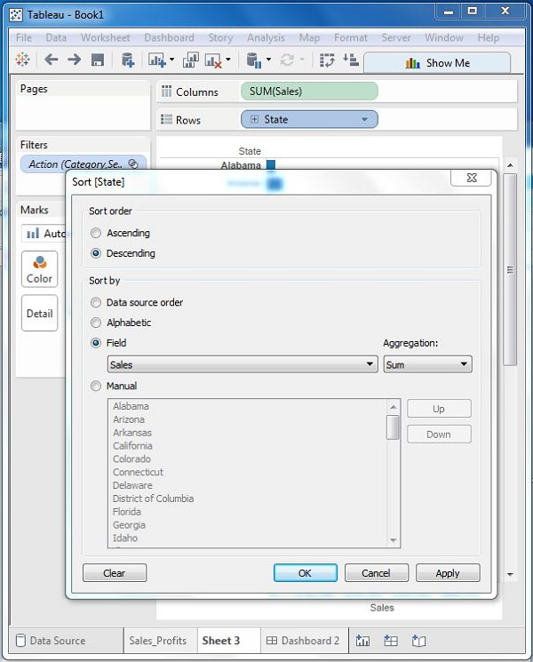
Step 3 − Next, create a blank dashboard by clicking the Create New Dashboard link at the bottom of the workbook. Right-click and rename the dashboard as Profit_Dashboard.
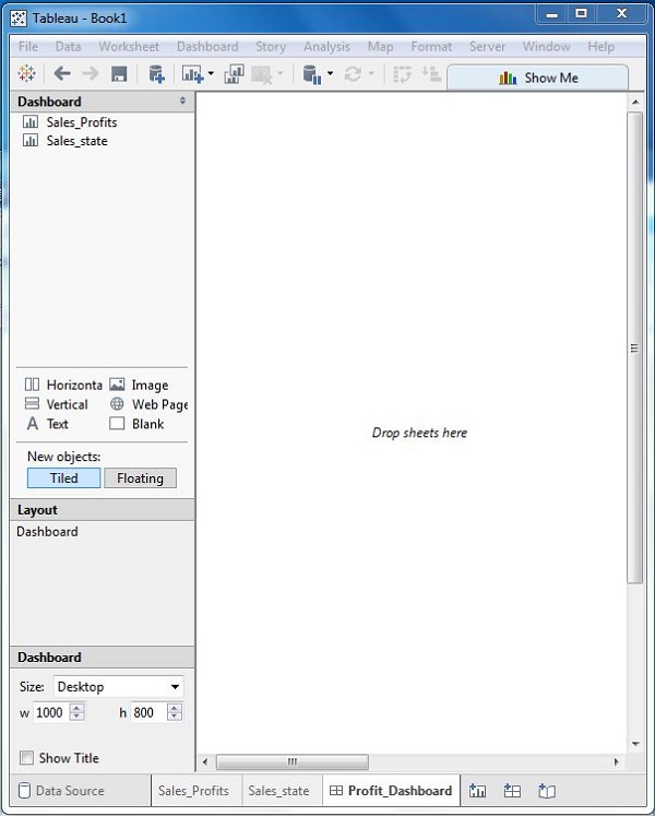
Step 4 − Drag the two worksheets to the dashboard. Near the top border line of Sales Profit worksheet, you can see three small icons. Click the middle one, which shows the prompt Use as Filter on hovering the mouse over it.
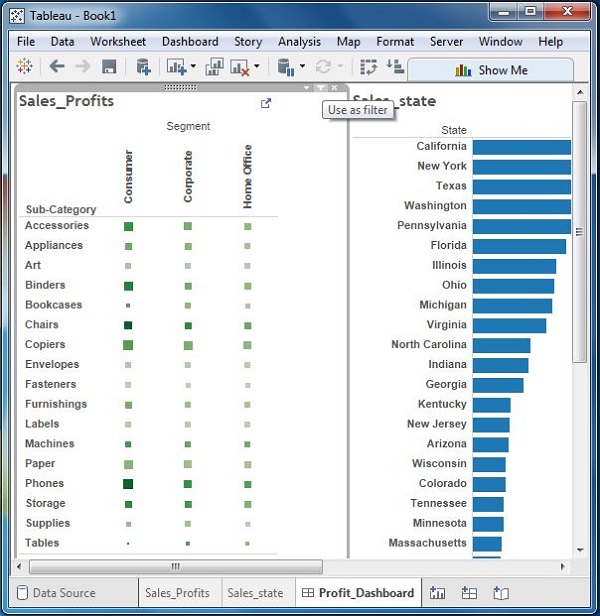
Step 5 − Now in the dashboard, click the box representing Sub-Category named Machines and segment named Consumer.
You can notice that only the states where the sales happened for this amount of profit are filtered out in the right pane named Sales_state. This illustrates how the sheets are linked in a dashboard.
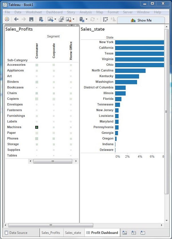
Tableau - Formatting
Tableau has a very wide variety of formatting options to change the appearance of the visualizations created. You can modify nearly every aspect such as font, color, size, layout, etc. You can format both the content and containers like tables, labels of axes, and workbook theme, etc.
The following diagram shows the Format Menu which lists the options. In this chapter, you will touch upon some of the frequently used formatting options.
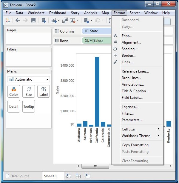
Formatting the Axes
You can create a simple bar chart by dragging and dropping the dimension Sub-Category into the Columns Shelf and the measure Profit into the Rows shelf. Click the vertical axis and highlight it. Then right-click and choose format.
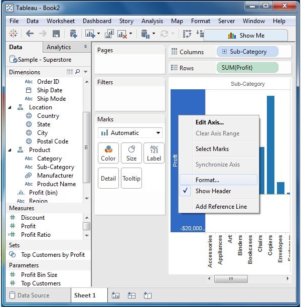
Change the Font
Click the font drop-down in the Format bar, which appears on the left. Choose the font type as Arial and size as 8pt. as shown in the following screenshot.
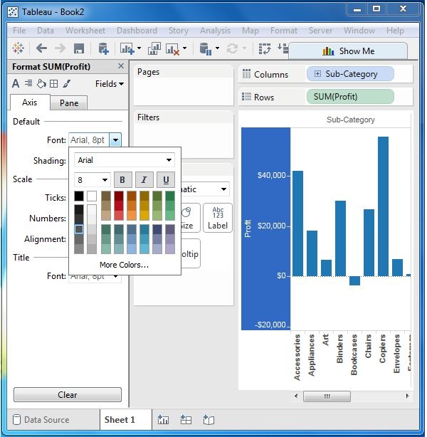
Change the Shade and Alignment
You can also change the orientation of the values in the axes as well as the shading color as shown in the following screenshot.
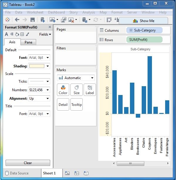
Format Borders
Consider a crosstab chart with Sub-Category in the Columns shelf and State in the Rows shelf. Now, you can change the borders of the crosstab table created by using the formatting options. Right-click on crosstab chart and choose Format.
The Format Borders appear in the left pane. Choose the options as shown in the following screenshot.
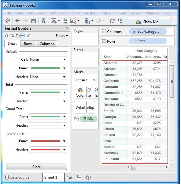
Tableau - Forecasting
Forecasting is about predicting the future value of a measure. There are many mathematical models for forecasting. Tableau uses the model known as exponential smoothing. In exponential smoothing, recent observations are given relatively more weight than older observations. These models capture the evolving trend or seasonality of the data and extrapolate them into the future. The result of a forecast can also become a field in the visualization created.
Tableau takes a time dimension and a measure field to create a forecast.
Creating a Forecast
Using the Sample-superstore, forecast the value of the measure sales for next year. To achieve this objective, following are the steps.
Step 1 − Create a line chart with Order Date (Year) in the columns shelf and Sales in the Rows shelf. Go to the Analysis tab as shown in the following screenshot and click Forecast under Model category.
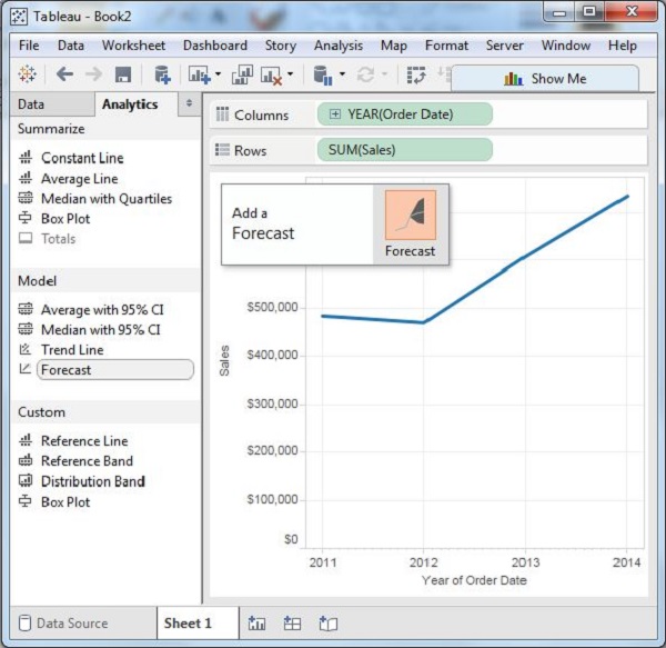
Step 2 − On completing the above step, you will find the option to set various options for forecast. Choose the Forecast Length as 2 years and leave the Forecast Model to Automatic as shown in the following screenshot.
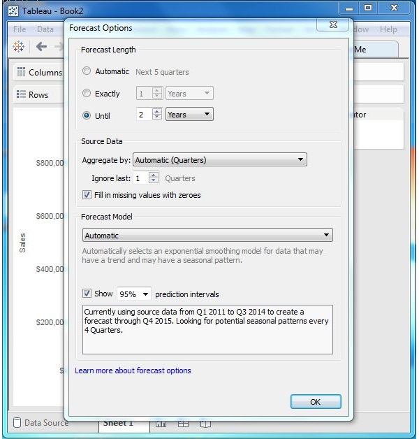
Click OK, and you will get the final forecast result as shown in the following screenshot.
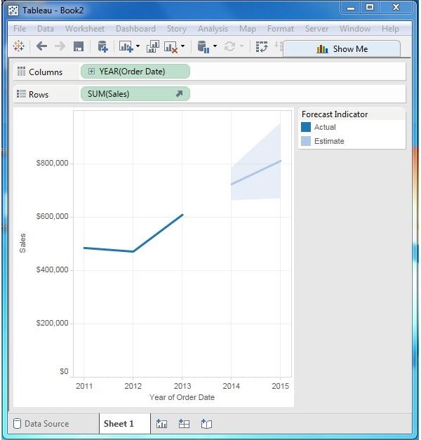
Describe Forecast
You can also get minute details of the forecast model by choosing the option Describe Forecast. To get this option, right-click on Forecast diagram as shown in the following screenshot.
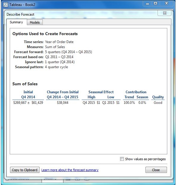
Tableau - Trend Lines
Trend lines are used to predict the continuation of a certain trend of a variable. It also helps to identify the correlation between two variables by observing the trend in both of them simultaneously. There are many mathematical models for establishing trend lines. Tableau provides four options. They are Linear, Logarithmic, Exponential, and Polynomial. In this chapter, only the linear model is discussed.
Tableau takes a time dimension and a measure field to create a Trend Line.
Creating a Trend Line
Using the Sample-superstore, find the trend for the value of the measure sales for next year. To achieve this objective, following are the steps.
Step 1 − Drag the dimension Order date to the Column shelf and the measure Sales to the Rows shelf. Choose the chart type as Line chart. In the Analysis menu, go to model → Trend Line. Clicking on Trend Line pops up an option showing different types of trend lines that can be added. Choose the linear model as shown in the following screenshot.
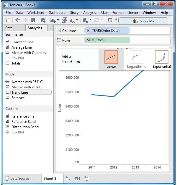
Step 2 − On completion of the above step, you will get various trend lines. It also shows the mathematical expression for the correlation between the fields, the P-Value and the R-Squared value.
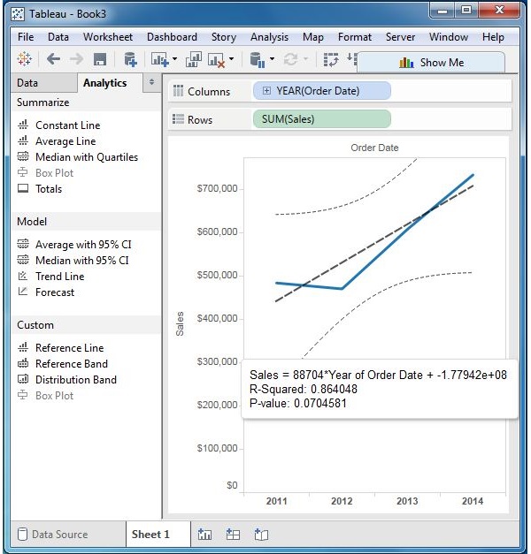
Describe the Trend Line
Right-click on the chart and select the option Describe Trend Line to get a detailed description of the Trend Line chart. It shows the coefficients, intercept value, and the equation. These details can also be copied to the clipboard and used in further analysis.
